Problem 1 [CO_COVID19]
Load the dataset CO_COVID19.csv
covid <- "CO_COVID19.csv" |>
  read.csv() |>
  dplyr::as_tibble()
Problem 1a
Draw a boxplot for the cumulative number of cases.
ggplot(covid, aes(CumulativeCases)) +
  geom_boxplot(fill = "navy") +
  labs(title = "Covid19 Cases", subtitle = "Cumulative Cases")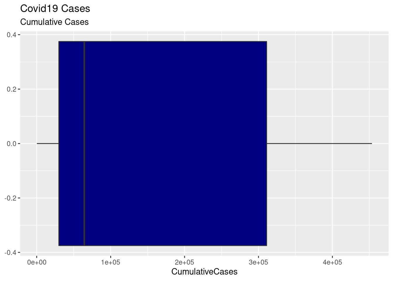
Problem 1b
Draw a boxplot for the cumulative number of deaths.
ggplot(covid, aes(CumulativeDeaths)) +
  geom_boxplot(fill = "violet") +
  labs(title = "Covid19 Deaths", subtitle = "Cumulative Deaths")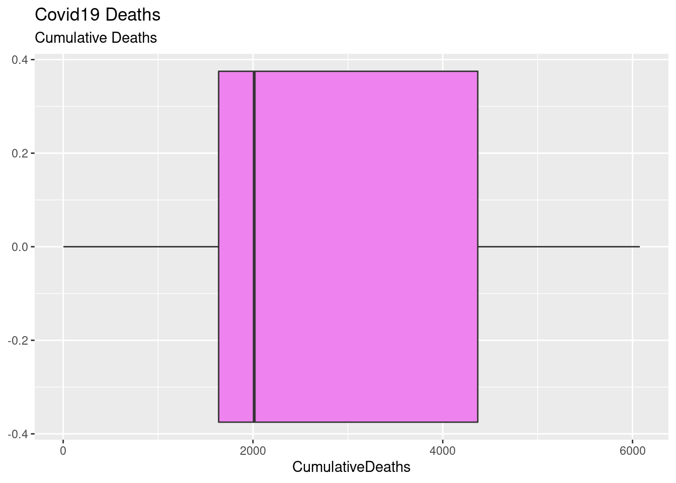
Problem 1c
Draw a scatterplot of the daily number of cases versus the daily number of deaths.
ggplot(covid) +
  aes(x = DailyCases, y = DailyDeaths) +
  geom_point(shape = 23) +
  geom_smooth(method = "lm", color = "red") +
  xlab("Daily Cases") +
  ylab("Daily Deaths") +
  ggtitle("Daily Covid19 Cases vs. Deaths")
## `geom_smooth()` using formula 'y ~ x'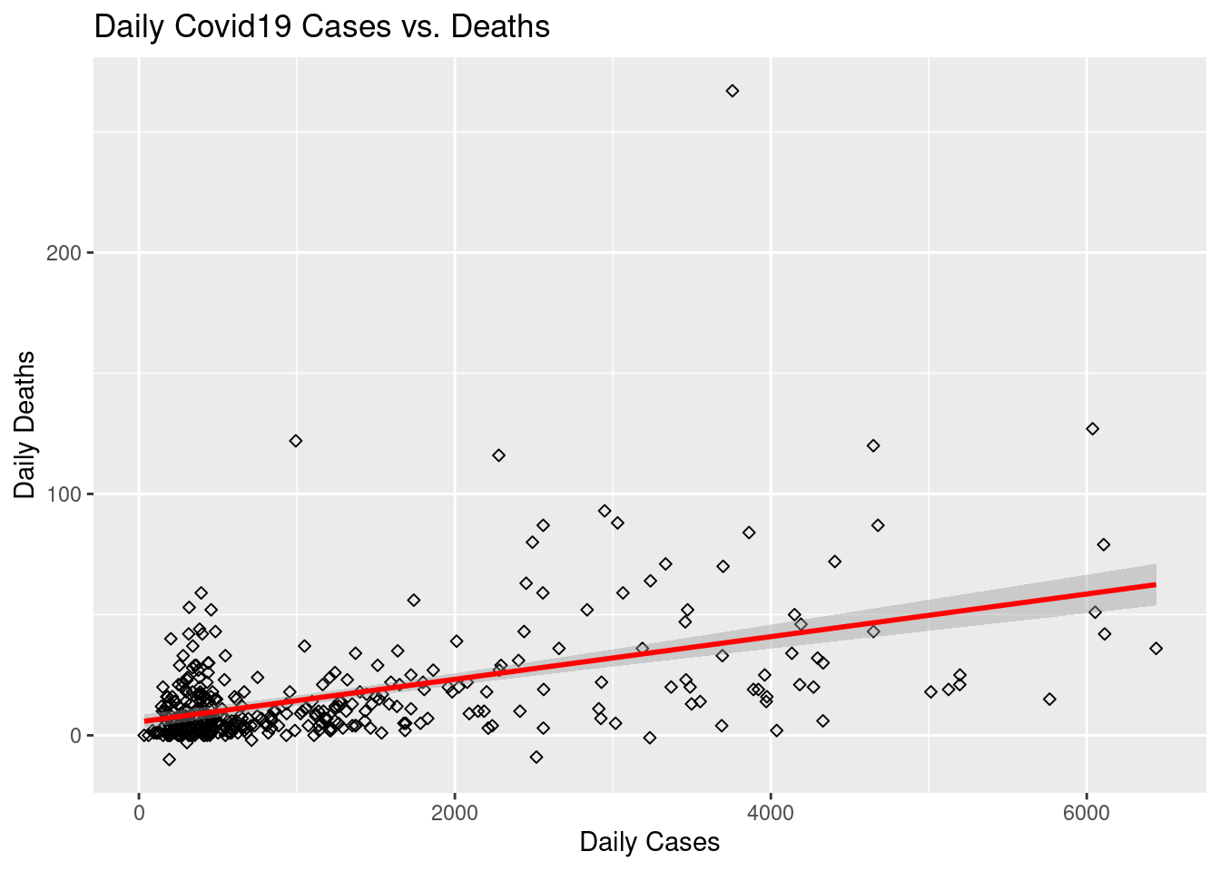
Load the given dataset
covid2 <- "CovidMonthlyData.csv" |>
  read.csv() |>
  dplyr::as_tibble()

# Clean up the date column.
covid2$Date <- covid2$Date |> my()
Problem 1d
Draw a bar graph for the monthly number of cases.
ggplot(covid2, aes(x = Date, y = Cases)) +
    geom_col(color = "black", fill = "deepskyblue") +
  scale_y_continuous(labels = comma) +
  labs(title = "Covid19 Cases by Month", x = "Date: (Month / Year)", y = "Number of Cases") +
  theme(axis.text.x = element_text(angle = 65, vjust = 0.6))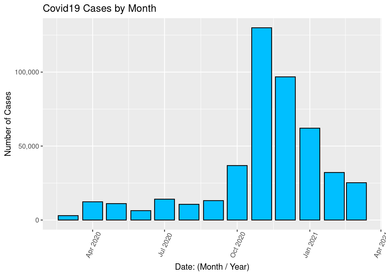
Problem 1d
Draw a bar graph for the monthly number of Deaths.
ggplot(covid2, aes(x = Date, y = Deaths)) +
    geom_col(color = "black", fill = "deepskyblue") +
  scale_y_continuous(labels = comma) +
  labs(title = "Covid19 Deaths per Month", x = "Date: (Month / Year)", y = "Number of Deaths") +
  theme(axis.text.x = element_text(angle = 65, vjust = 0.6))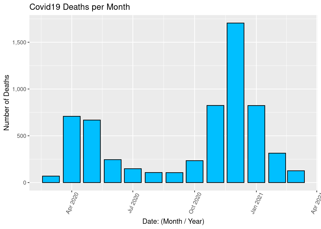
Problem 1f
Draw a pie chart for the monthly number of cases
ggplot(covid2) +
  aes(x = "", y=Cases, fill = factor(Date)) +
  geom_col() +
  labs(fill = "Date", x=NULL, y=NULL,
      title = "Covid19 Cases per Month") +
  coord_polar(theta = "y", start = 0) +
  scale_y_continuous(labels = comma)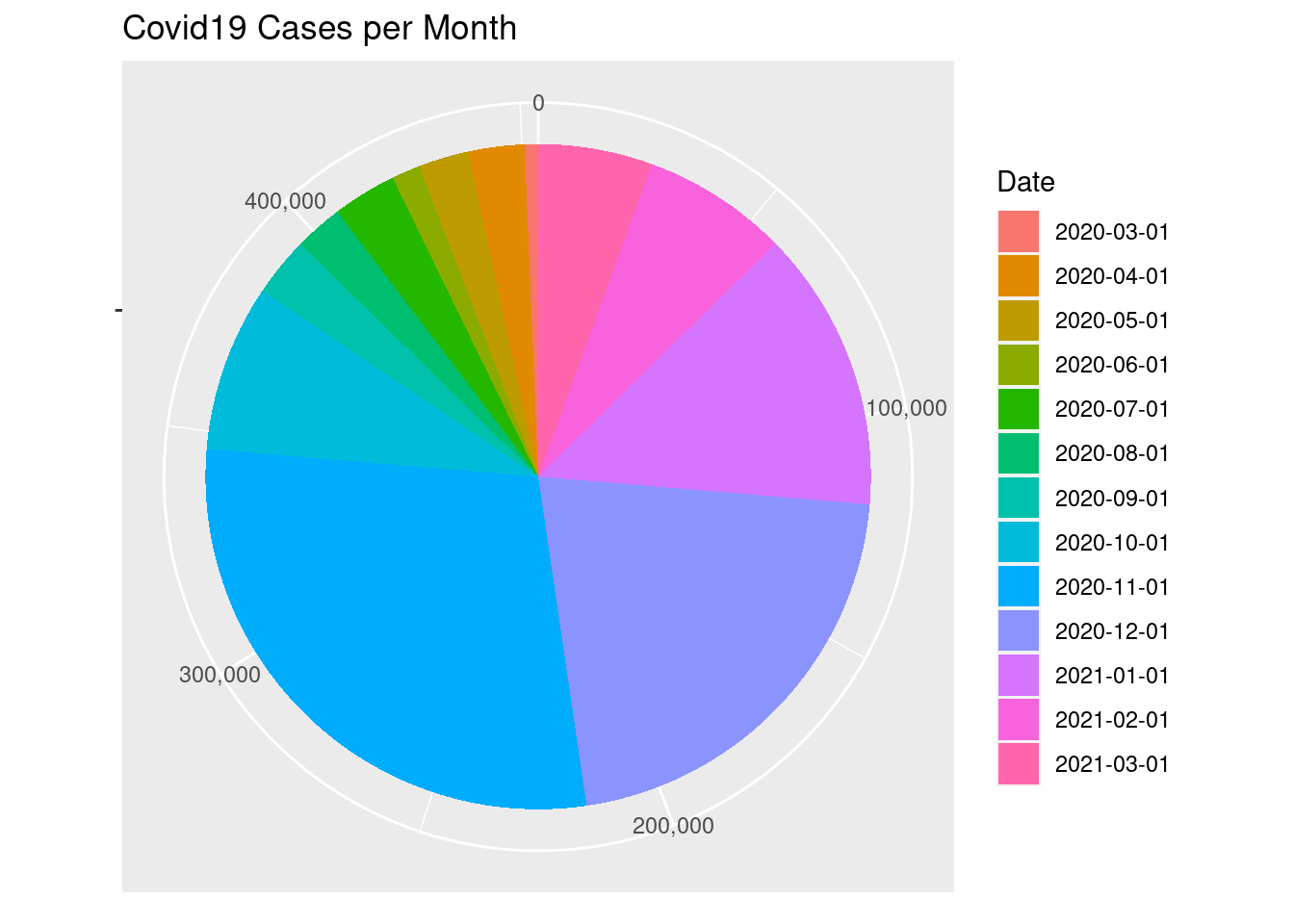
ggplot(covid2) +
  aes(x = "", y=Deaths, fill = factor(Date)) +
  geom_col() +
  labs(fill = "Date", x=NULL, y=NULL,
      title = "Covid19 Deaths per Month") +
  coord_polar(theta = "y", start = 0) +
  scale_y_continuous(labels = comma)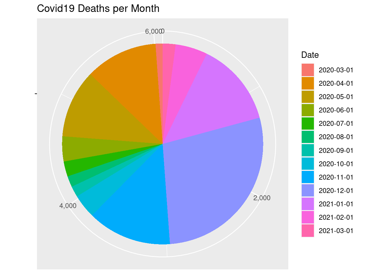
Problem 2
For the mpg dataset, redo the following plots from the Week 12 Lab using the city mpg instead of the highway mpg.
Problem 2a
Redo the scatterplot with shape = drv, color = drv
ggplot(mpg, aes(x = displ, y = cty, shape = drv, color = drv)) + geom_point()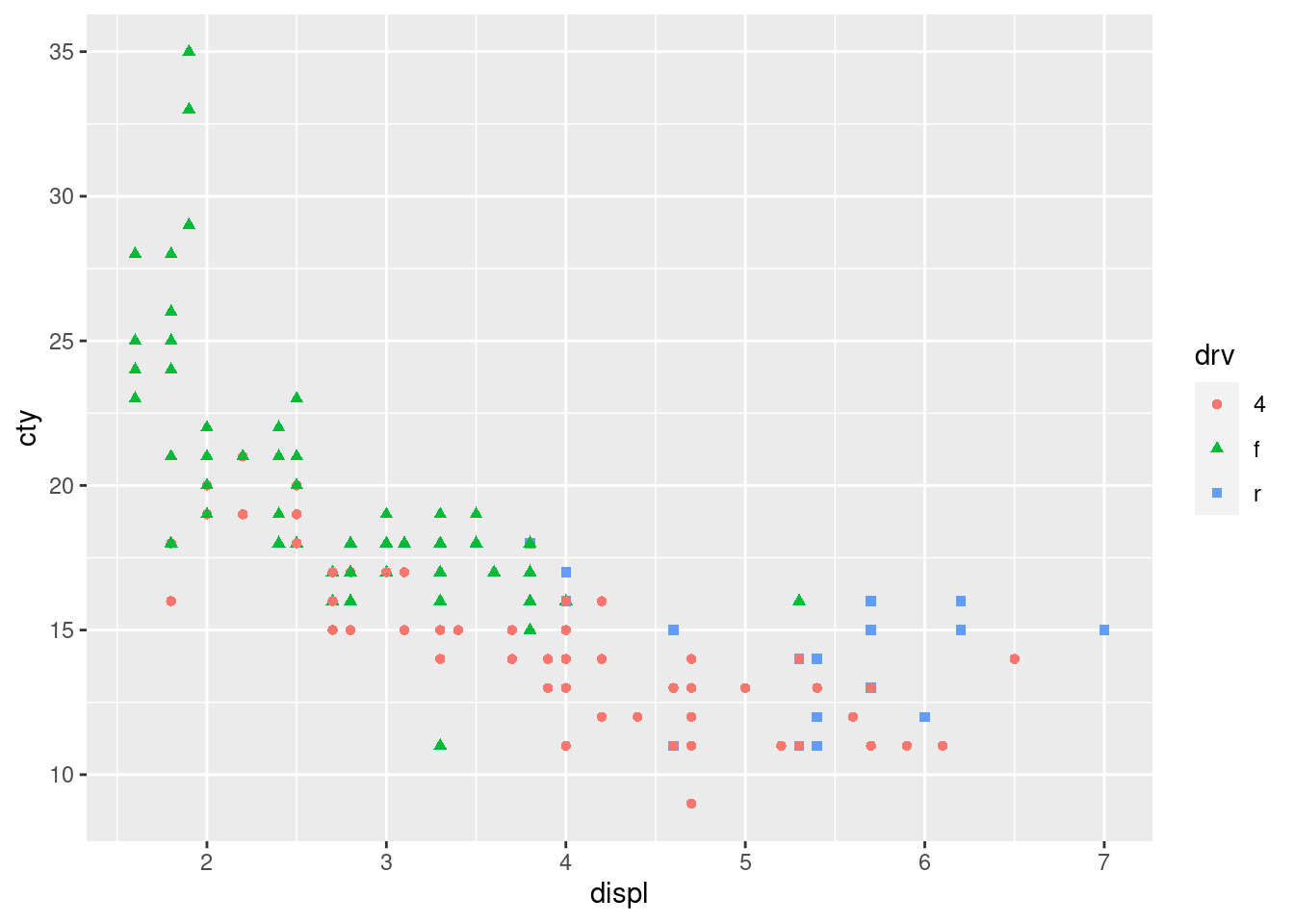
Problem 2b
The facet_wrap plots with ‘class’ and ‘drv’
ggplot(mpg, aes(x = displ, y = cty)) + geom_point(color = "purple") +
facet_wrap(~class, nrow = 2)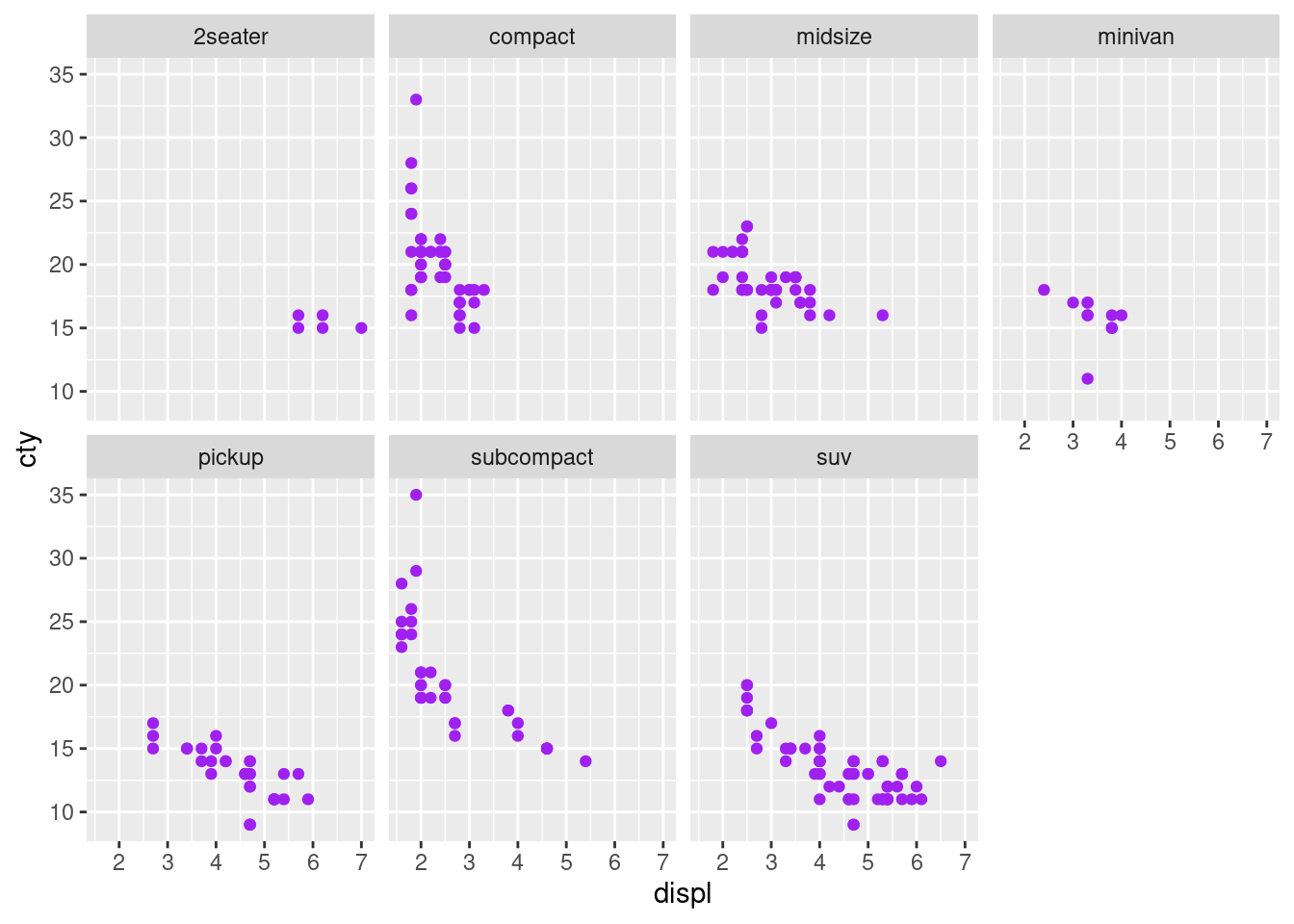
ggplot(mpg, aes(x = displ, y = cty)) + geom_point(color = "red") +
  facet_wrap(~drv)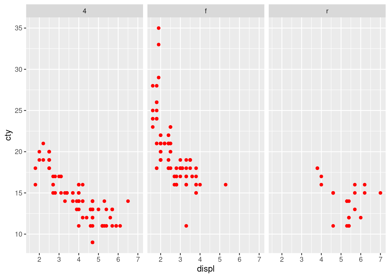
Problem 2c
The bar chart of make vs. average city mpg.
make <- unique(mpg$manufacturer)
cty_mean <- tapply(mpg$cty, mpg$manufacturer, mean)
mpg2 <- data.frame(make, cty_mean)

ggplot(mpg2, aes(x = make, y = cty_mean)) +
geom_bar(stat = "identity", width = 0.5, fill = "cyan3") +
labs(title = "Bar Chart", subtitle = "Make vs. Avg City MPG",
x = "Make", y = "City Mileage MPG", caption="Source: Frequency of
Manufacturers from ’mpg’ dataset") +
theme(axis.text.x = element_text(angle = 65, vjust = 0.6))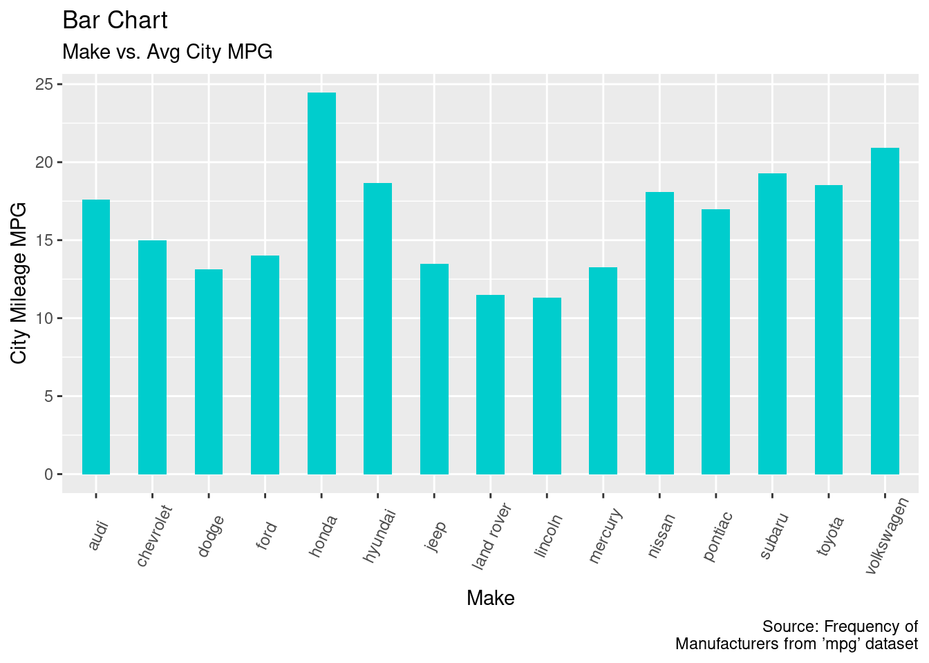
Problem 2d
The lollipop chart of make vs. average city mpg.
ggplot(mpg2, aes(x = make, y = cty_mean)) + geom_point(size = 3) +
  geom_segment(aes(x = make, xend = make, y = 0, yend = cty_mean)) +
  labs(title = "Lollipop Chart", subtitle = "Make Vs Avg City MPG",
  x = "Make", y = "City Mileage MPG", caption="Source: Frequency of
  Manufacturers from ’mpg’ dataset") +
  theme(axis.text.x = element_text(angle = 65, vjust = 0.6))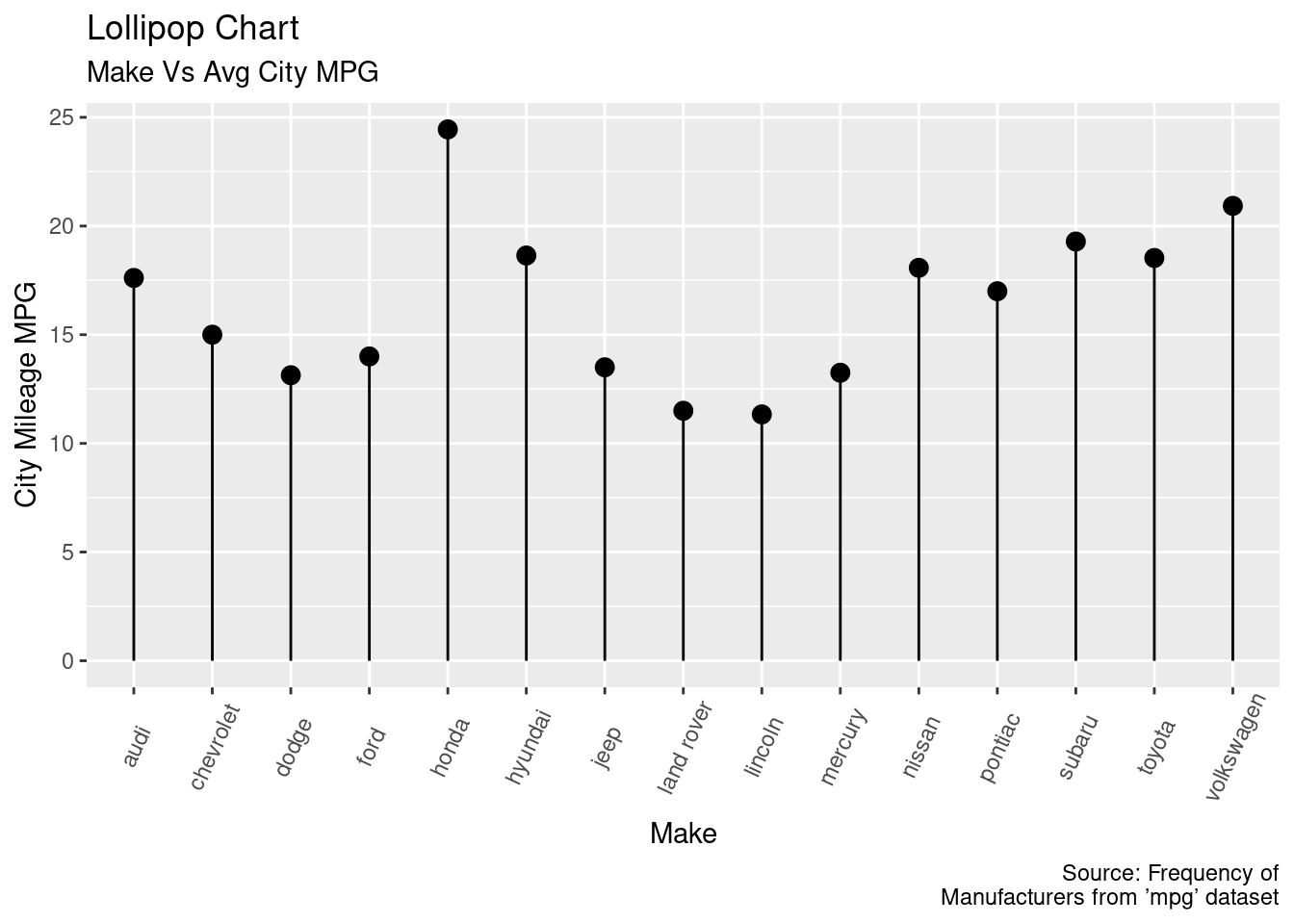
Problem 3
Load the dataset
penguins <- "penguins.csv" |>
  read.csv() |>
  dplyr::as_tibble()
Problem 3a
Compute: i) The overall average body mass ii) The average body mass by species iii) The average body mass by island iv) the average body mass by sex.
#p3i overall body mass (grams)
mean(penguins$body_mass_g)
## [1] 4201.754#p3ii body mass by species (grams)
tapply(penguins$body_mass_g, penguins$species, FUN = mean)## Adelie Chinstrap Gentoo
## 3700.662 3733.088 5076.016# p3iii body mass by island (grams)
tapply(penguins$body_mass_g, penguins$island, FUN = mean)## Biscoe Dream Torgersen
## 4716.018 3712.903 3706.373# p3iv body mass by sex (grams)
tapply(penguins$body_mass_g, penguins$sex, FUN = mean)## female male
## 3866.420 4529.335Problem 3b
Draw a histogram of the body mass.
ggplot(penguins, aes(body_mass_g)) +
  geom_histogram(color = "black", fill = "palegreen1", bins = 40) +
  labs(title = "Distribution of Penguin Body Mass",
       x = "Body Mass in Grams")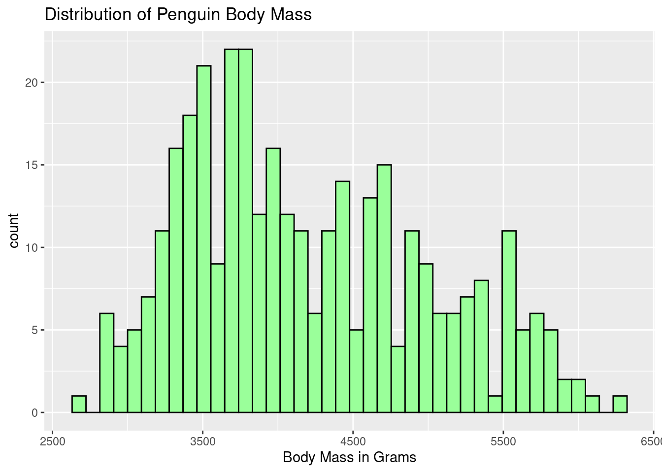
ggplot(penguins, aes(body_mass_g)) +
  scale_fill_brewer(palette = "Paired") +
  geom_histogram(color = "black", aes(fill = species), binwidth = 125) +
  labs(title = "Body Mass across Penguin Species",
       x = "Body Mass in Grams")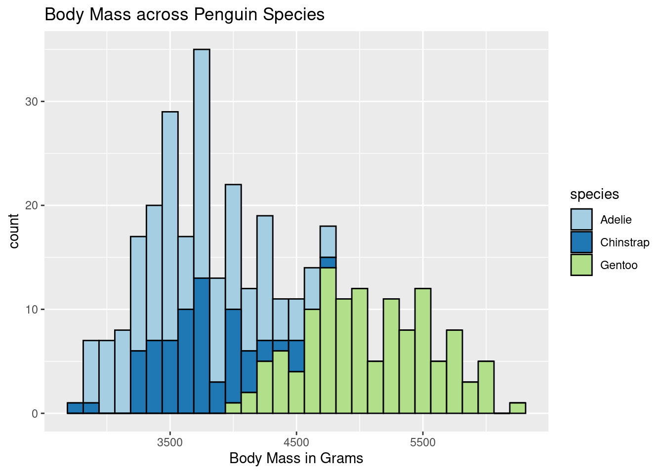
ggplot(penguins, aes(body_mass_g)) +
  scale_fill_brewer(palette = "Accent") +
  geom_histogram(aes(fill = island), binwidth = 80, color = "black") +
  labs(title = "Body Mass of Penguins across Islands",
       x = "Body Mass in Grams")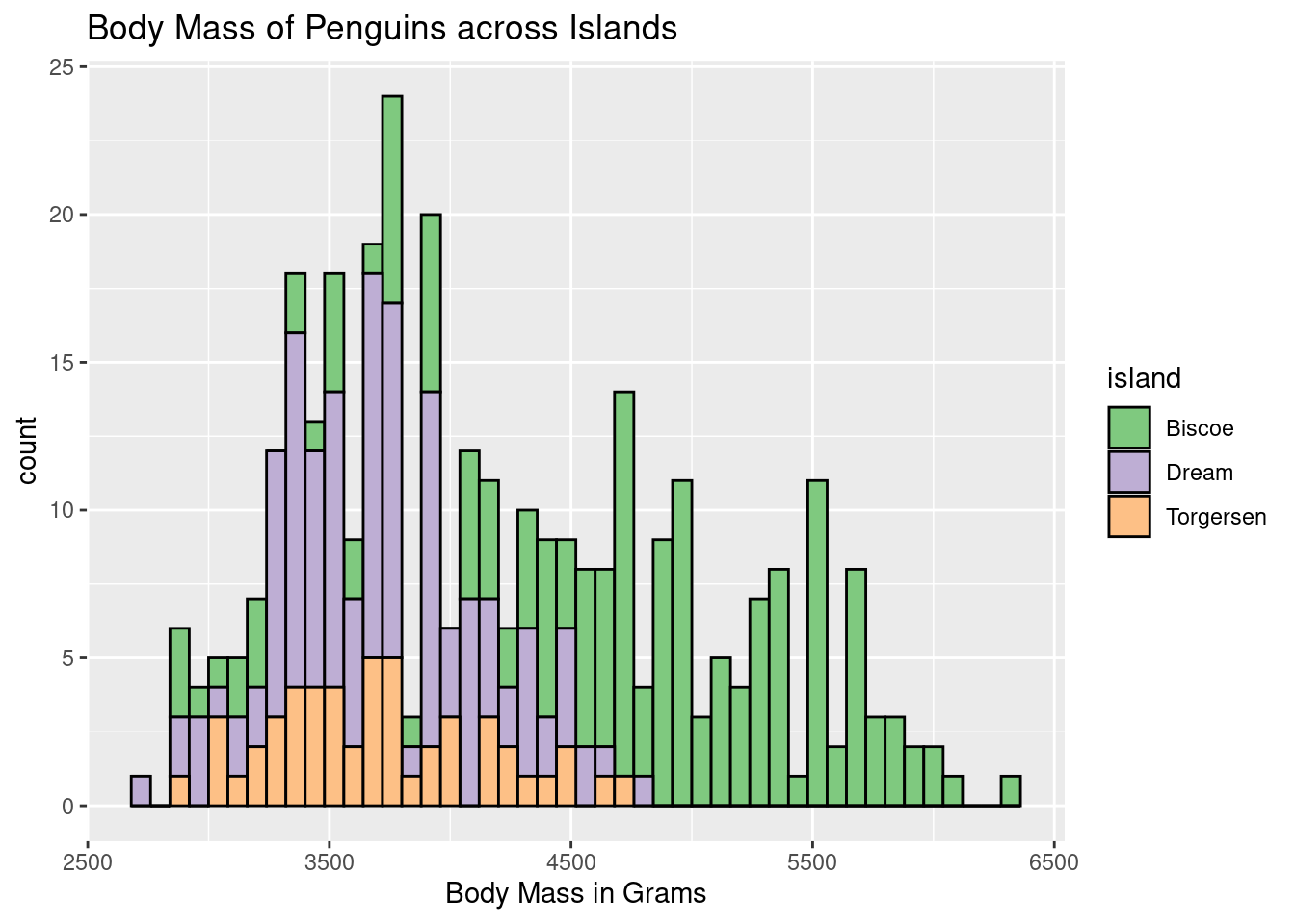
ggplot(penguins, aes(body_mass_g)) +
  geom_histogram(color = "black", aes(fill = sex), binwidth = 50) +
  labs(title = "Body Mass of Penguins by Sex",
       x = "Body Mass in Grams")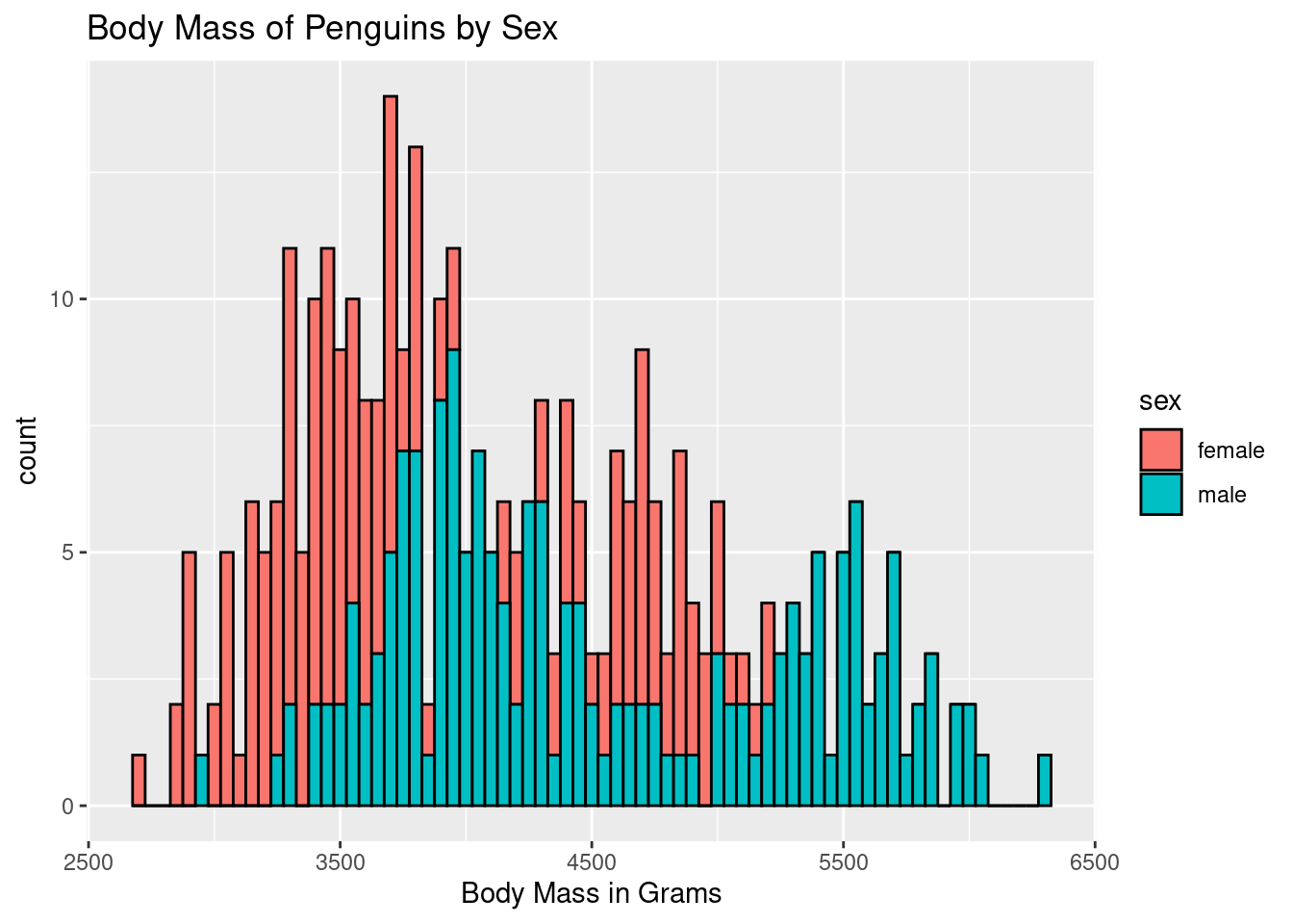
Problem 4 [Epicycloids]
The parametric equations for the epicycloid on \([0, (R + r)\pi]\) are:
\[x = (R + r) \cos t - r \cdot \cos \left( \frac{R + r}{r} \cdot t \right)\] \[y = (R + r) \sin t - r \cdot \sin \left( \frac{R + r}{r} \cdot t \right)\]
Problem 4a
Modify your epicycloid function from HW 9 to include color, and replace the plot() command with the provided ggplot command.
Epicycloid <- function(r, R, color){
  t <- seq(from=0, to=(R + r)*2*pi, len=10000)

  x <- (R + r)*cos(t) - (r * cos(((R+r)/r)*t))
  # print(x)

  y<- (R + r)*sin(t) - (r * sin(((R+r)/r)*t))
  # print(y)

  ggplot(data.frame(t, x, y), aes(x,y)) + geom_path(color = color) +
    ggtitle(paste("Epicycloid: r =", r, ", R = ", R)) +
    theme_void()
  }
Epicycloid(r = 1, R = 4, color = "red")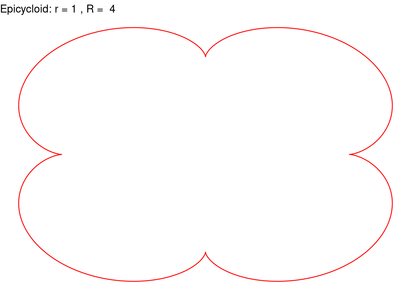
Epicycloid(r = 6, R = 5, color = "violetred3")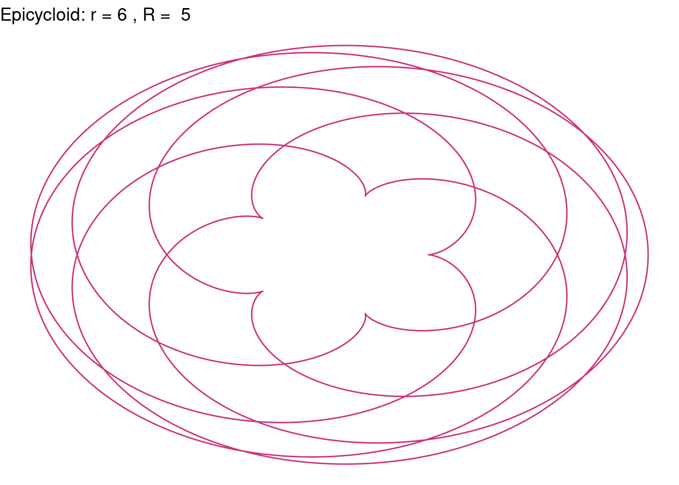
Epicycloid(r = 10, R = 21, color = "red")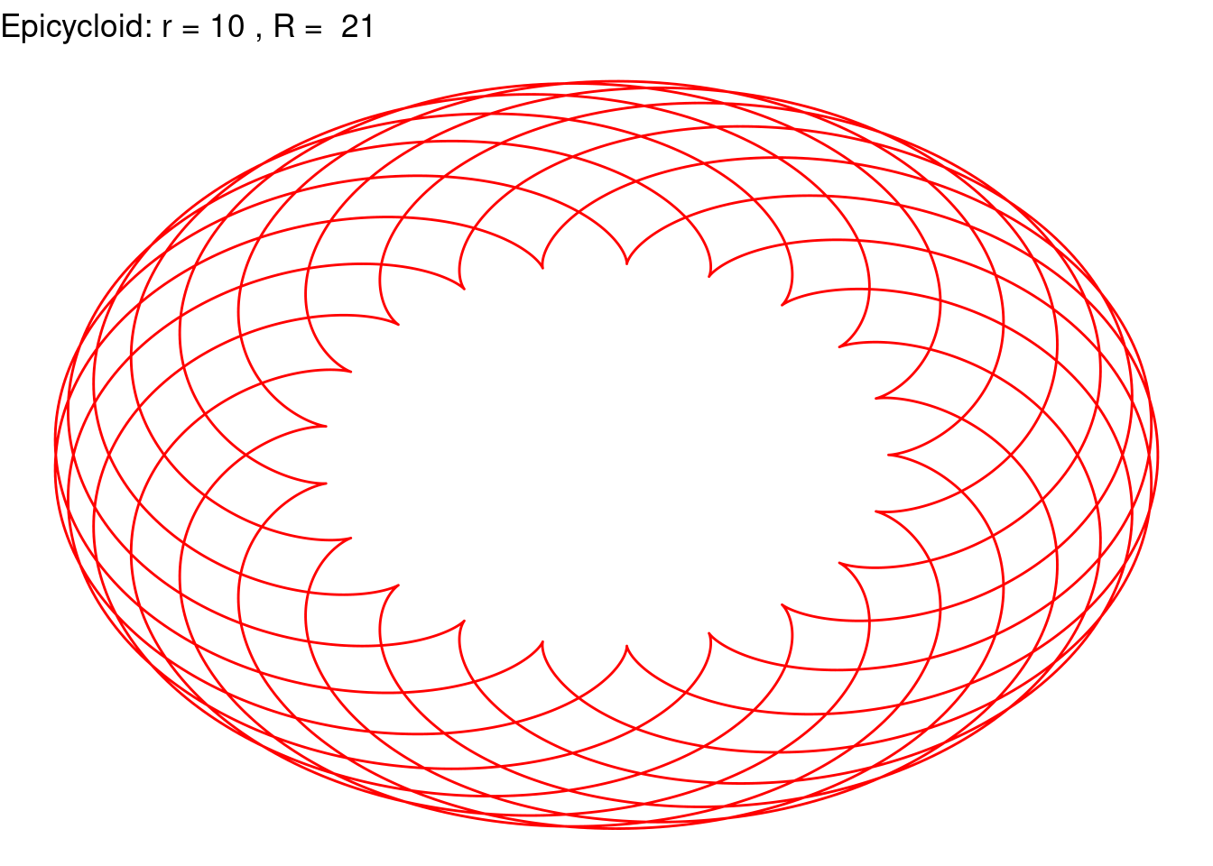
Epicycloid(r = 32, R = 33, color = "violetred3")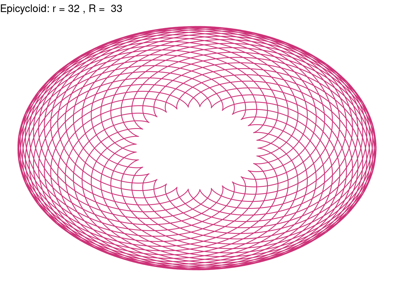
Epicycloid(r = 18, R = 4, color = "tomato4")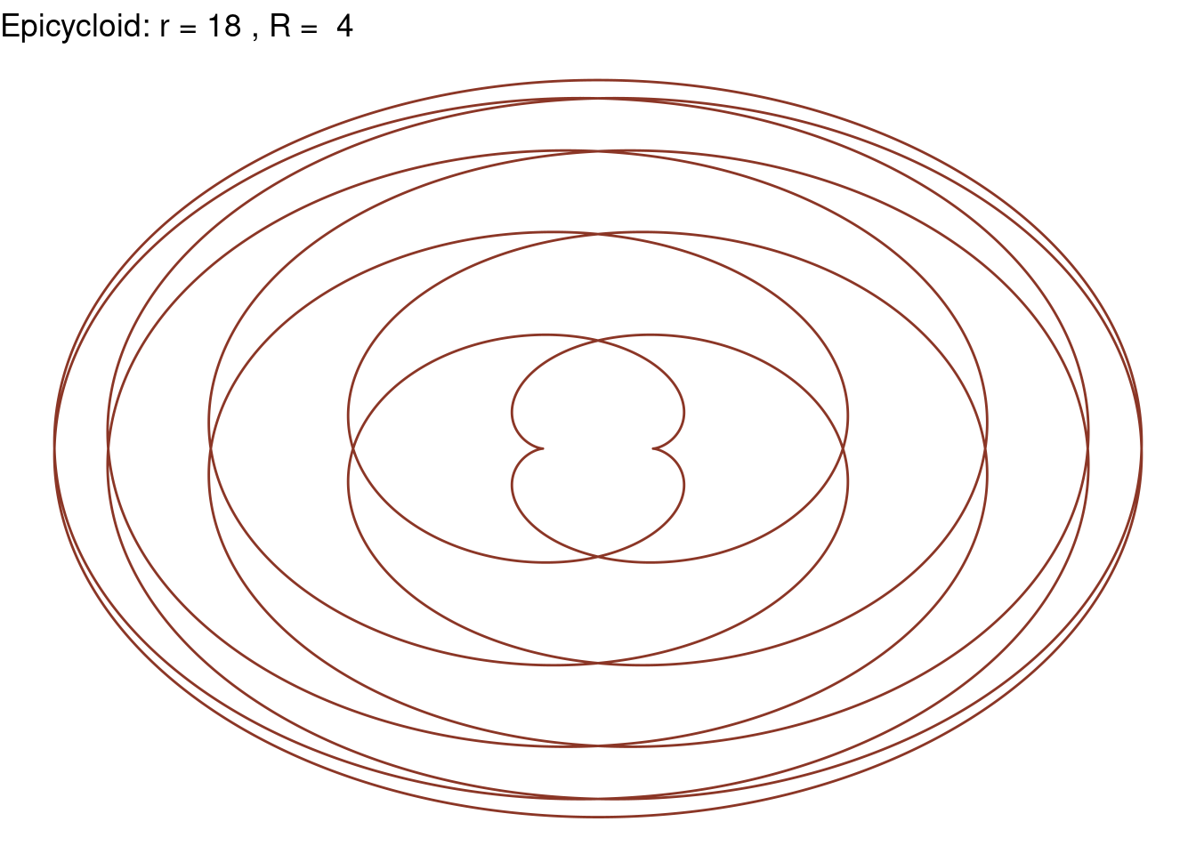
Epicycloid(r = 72, R = 71, color = "sienna")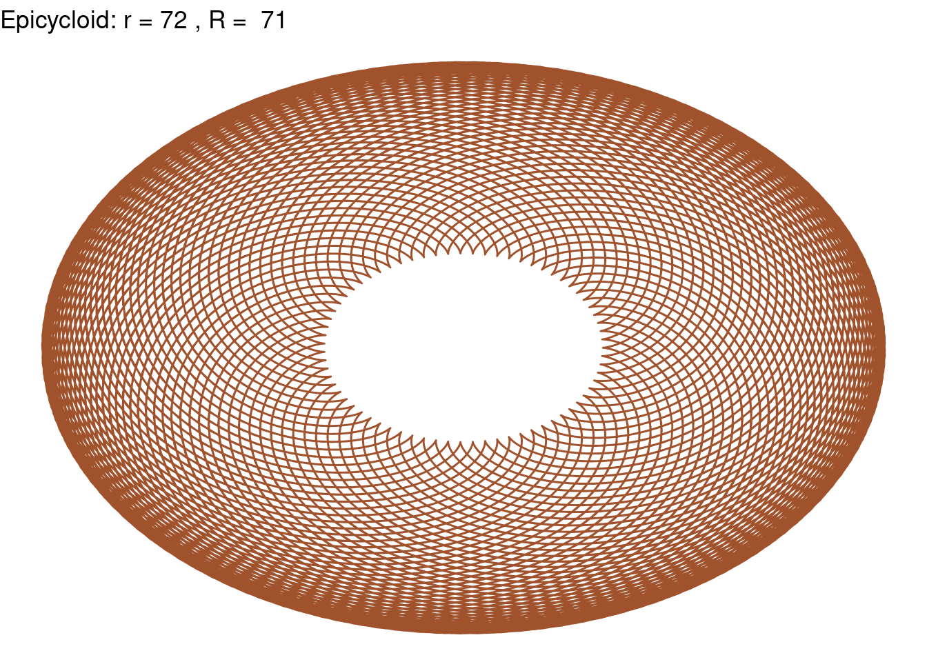
Epicycloid(r = 30, R = 65, color = "purple3")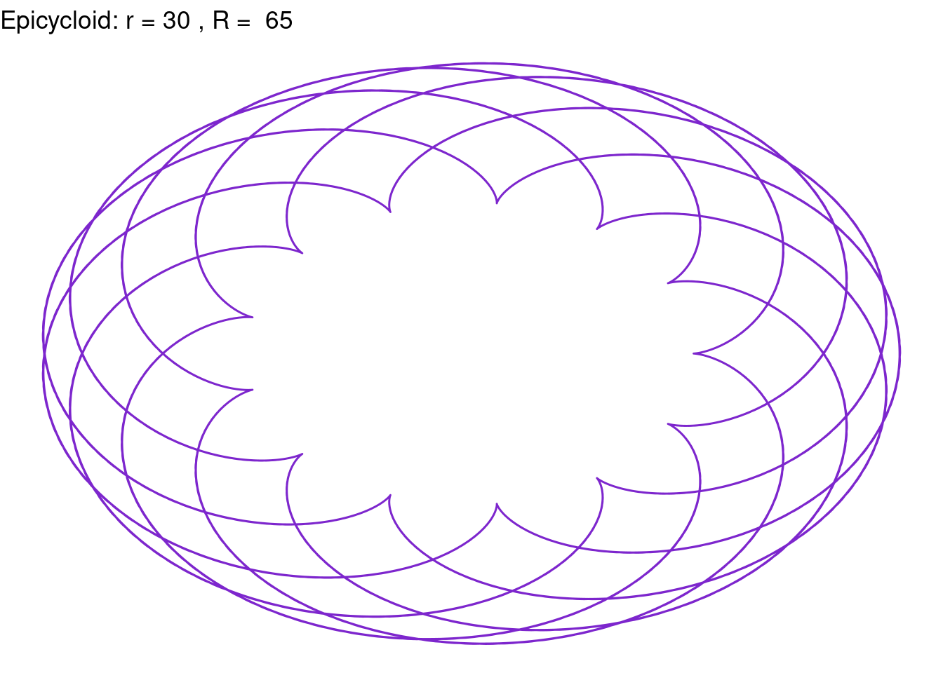
Problem 5 [Rose Curves]
Rose <- function(k, color){
  t <- seq(from=0, to=(2*pi*(10/k)), by=0.001)

  x <- cos(k*t)*cos(t)
  y <- cos(k*t)*sin(t)


  ggplot(data.frame(t, x, y), aes(x,y)) + geom_path(color = color) +
    ggtitle(paste("Epicycloid: k =", k)) +
    theme_void()
  }
Rose(k=4, color="blue2")
Rose(k=5, color="blue3")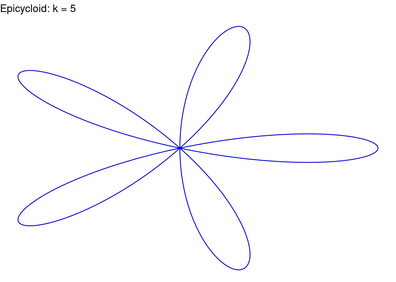
Rose(k=(3/5), color="chocolate1")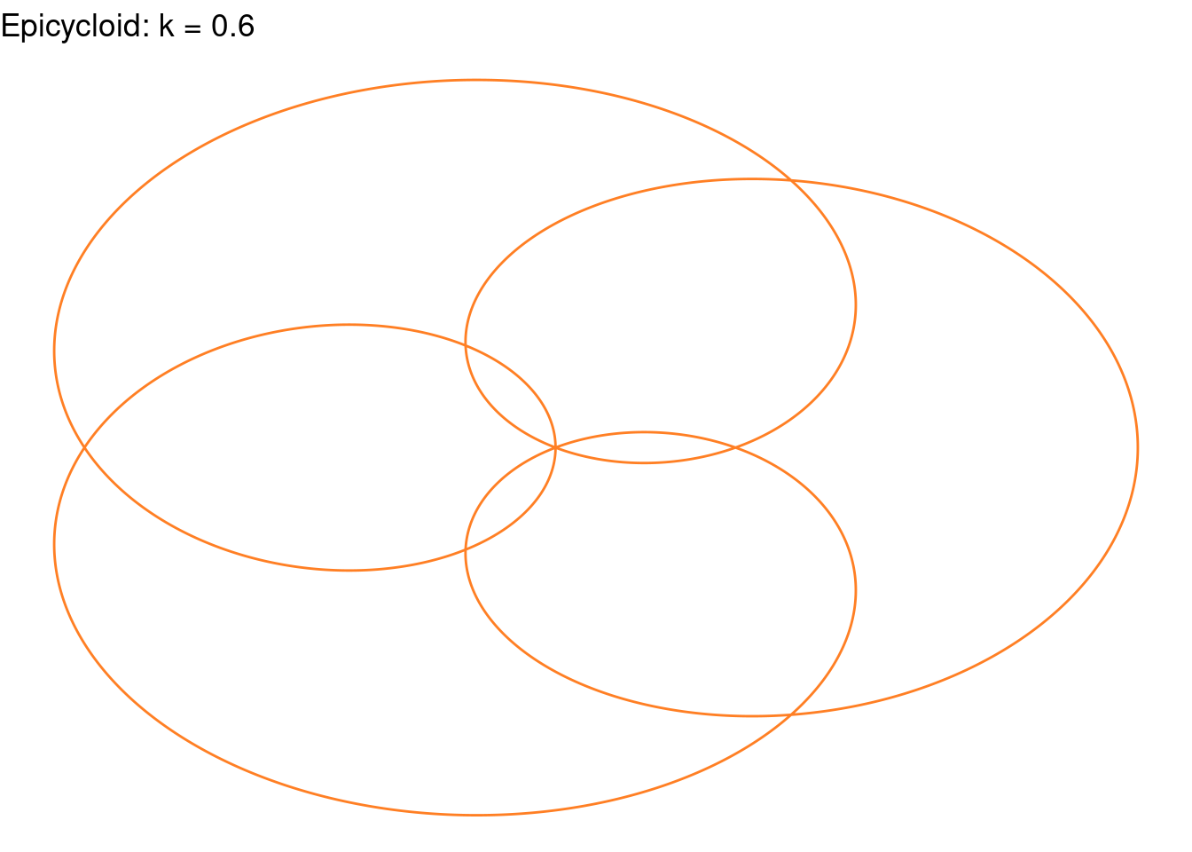
Rose(k=(4/5), color="chocolate1")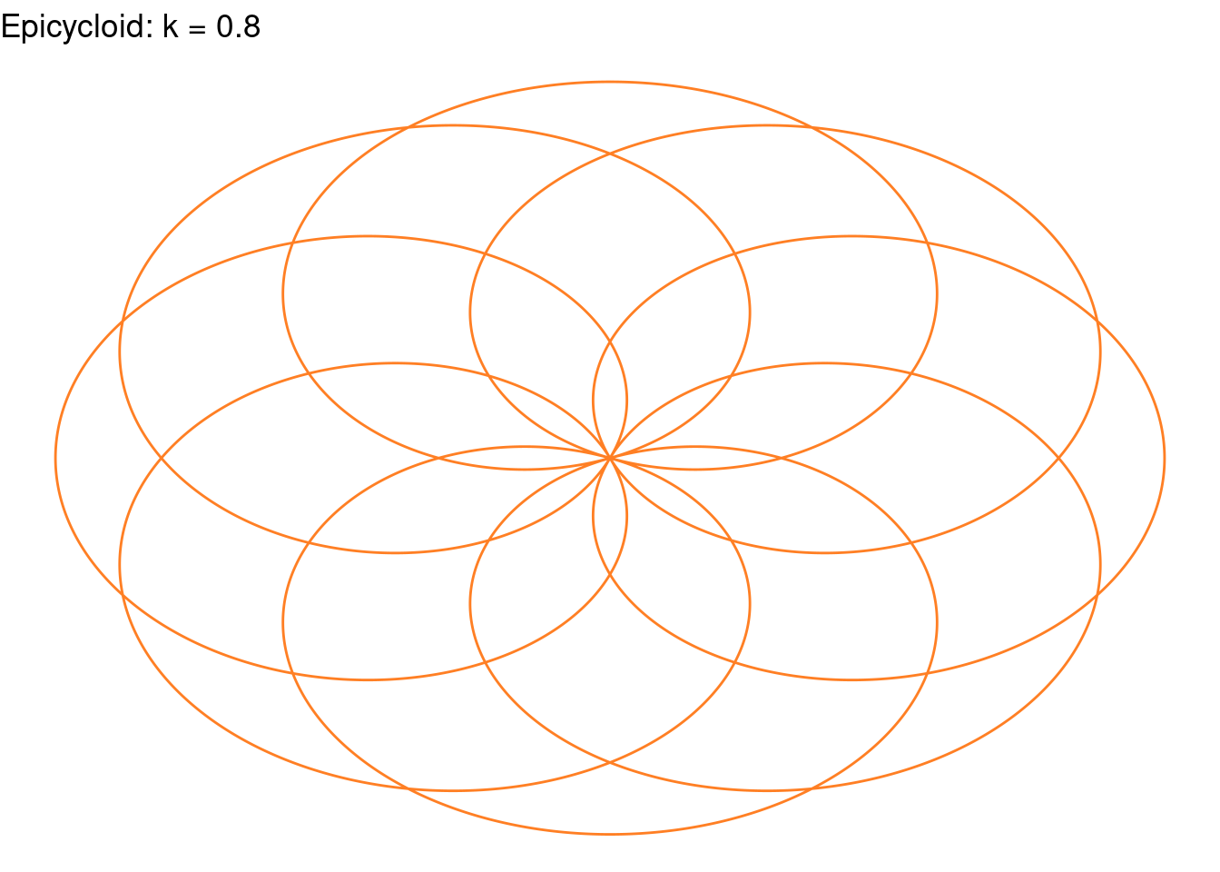
Rose(k=1.2, color="indianred2")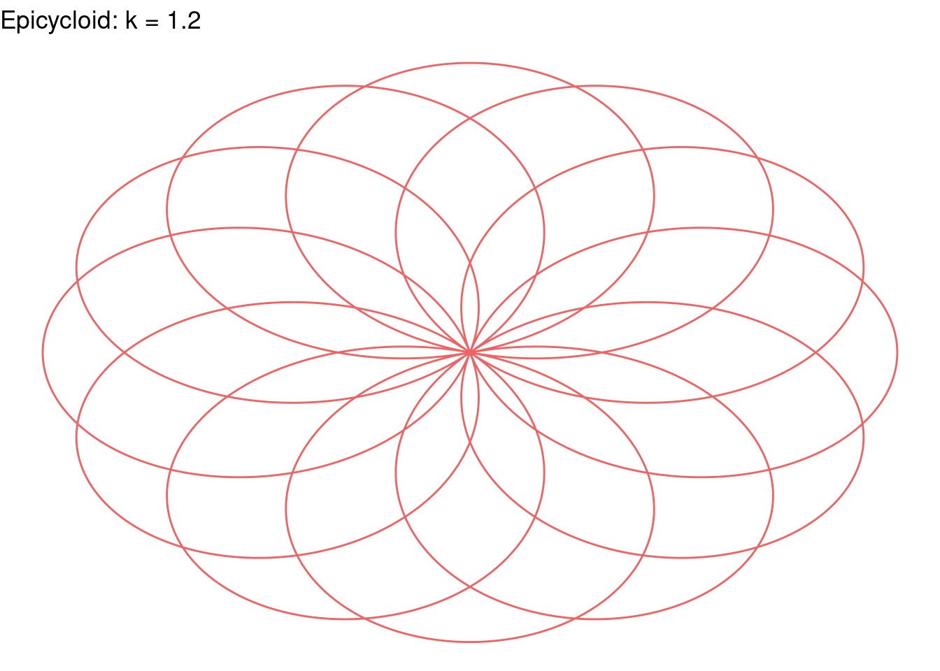
Rose(k = 12, color = "purple")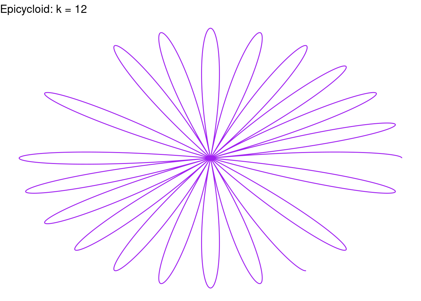
Rose(k=27, color = "purple")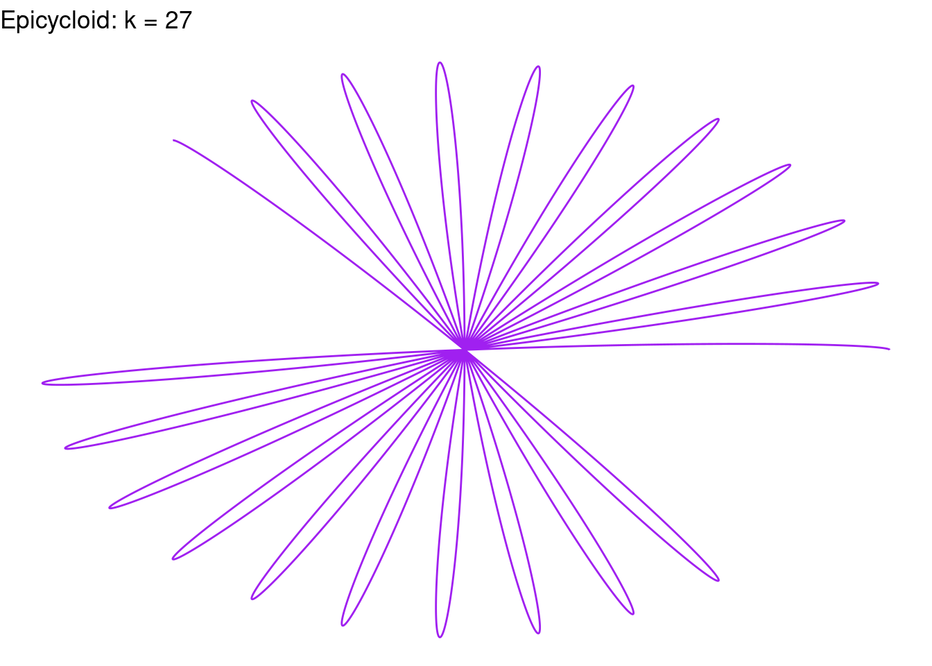
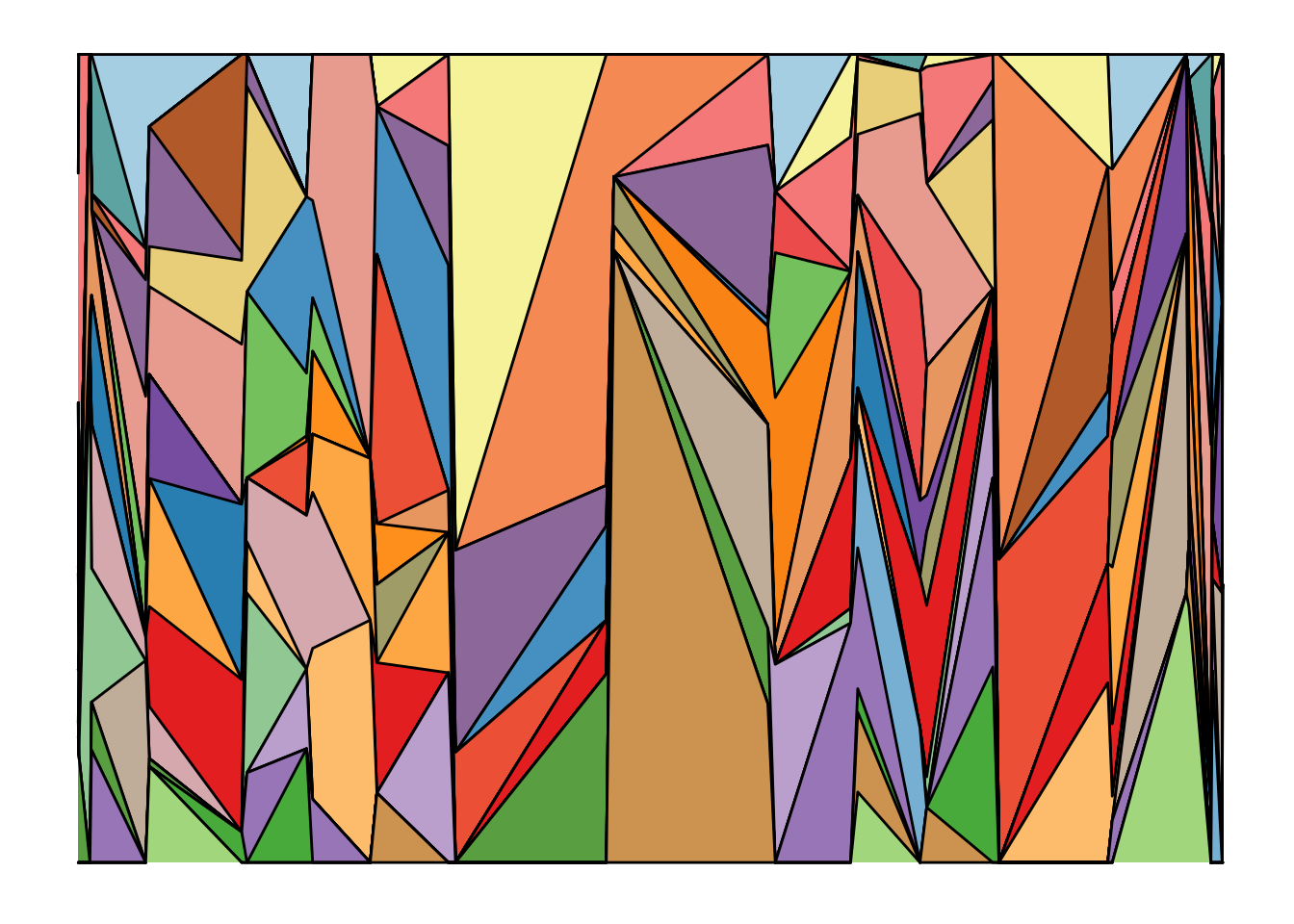
Problem 6.
Make one or more ‘heatmap’ images.
data <- matrix(rnorm(150), nrow=10)
heatmap(data, Colv = NA, Rowv = NA, scale = "none")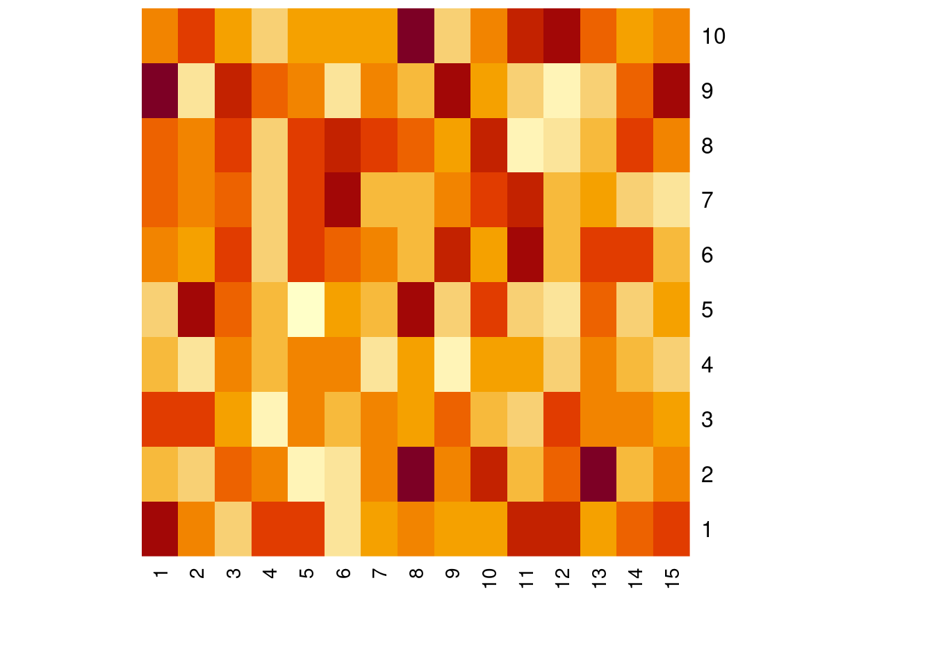
Problem 7
Modify the given code to make one or more variations of the artwork.
set.seed(345) #set the seed of R's random number generator
library(ggplot2)
library(RColorBrewer)
## Warning: package 'RColorBrewer' was built under R version 4.1.3ngroup=32 # changes how many groups there are in the art graph
names=paste("G_",seq(1,ngroup),sep="")
DAT=data.frame()#creating dataframe
for(i in seq(1:ngroup)){
data=data.frame( matrix(0, ngroup , 3))
data[,1]=cos(i) + sin(i)
data[,2]=sample(names, nrow(data))
data[,3]=prop.table(sample( c(rep(0,150),c(1:ngroup)) ,nrow(data)))
DAT=rbind(DAT,data)
}
colnames(DAT)=c("Year","Group","Value")
DAT=DAT[order( DAT$Year, DAT$Group) , ]
coul = brewer.pal(12, "Paired")
coul = colorRampPalette(coul)(ngroup)
coul=coul[sample(c(1:length(coul)) , size=length(coul) ) ] #deciding the color for the paletteggplot(DAT, aes(x=Year, y=Value, fill=Group )) +
geom_area(alpha=1 , color=1 )+
theme_bw() +
scale_fill_manual(values = coul)+
theme(line = element_blank(),
text = element_blank(),
title = element_blank(),
legend.position="none",
panel.border = element_blank(),
panel.background = element_blank())