Section 12.1: 2-5, 7-8
Exercise 2:
Considering the following observations create a scatter plot of \(NO_x\) emissions versus age. What appears to be the relationship between these two variables?
engine <- c(1, 2, 3, 4, 5, 6, 7, 8, 9, 10)
age <- c(0, 0, 2, 11, 7, 16, 9, 0, 12, 4)
baseline <- c(1.72, 4.38, 4.06, 1.26, 5.31, 0.57, 3.37, 3.44,
    0.74, 1.24)
reform <- c(1.88, 5.93, 5.54, 2.67, 6.53, 0.74, 4.94, 4.89, 0.69,
    1.42)

df <- data.frame(engine = engine, age = age, baseline = baseline,
    reformulated = reform)

ggplot(data = df, aes(x = age, y = baseline)) + geom_point() +
    theme_gray()

ggplot(data = df, aes(x = age, y = reform)) + geom_point() +
    theme_gray()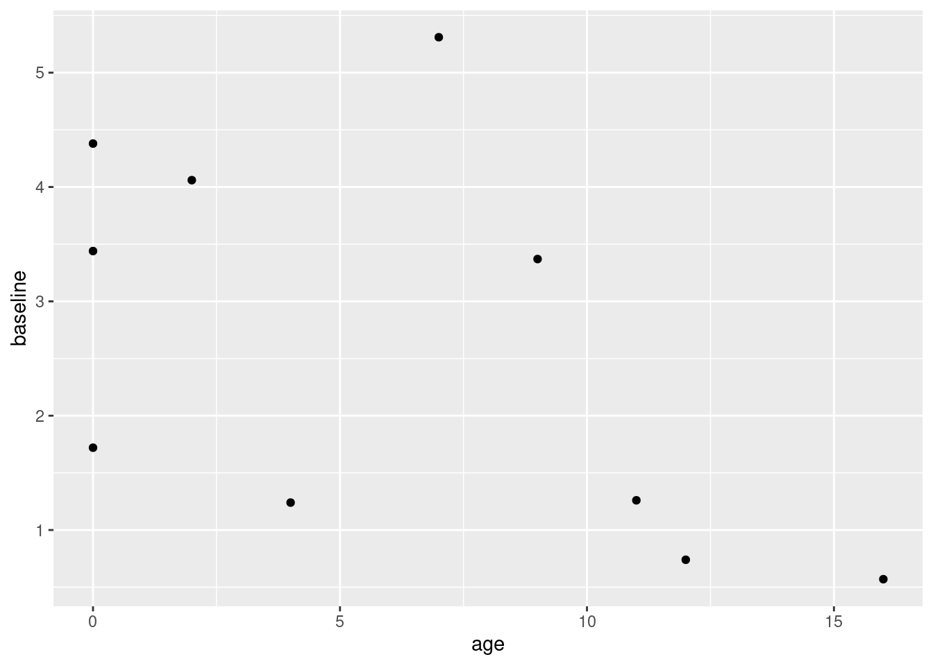
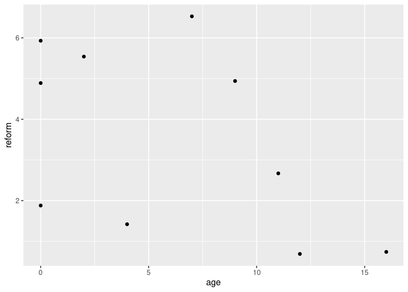
There appears to be a slight negative relationship between the two variables. I say slight because there is a lot of apparent variance in the data here, and with such a small sample size it’s hard to draw any definitive conclusions from the scatter plot alone.
Exercise 3.
Construct a scatterplot of the given bivariate data. Let x = hydrogen concentration (ppm) using a gas chromatography method and y = concentration using a new sensor method. Does there appear to be a very strong relationship between the two types of concentration measurement? Do the two methods appear to be measuring the same quantity?
x <- c(47, 62, 65, 70, 70, 78, 95, 100, 114, 118, 124, 127, 140,
    140, 140, 150, 152, 164, 198, 221)

y <- c(38, 62, 53, 67, 84, 79, 93, 106, 117, 116, 127, 114, 134,
    139, 142, 170, 149, 154, 200, 215)

df <- data.frame(x, y)
ggplot(data = df, aes(x = x, y = y)) + geom_point() + theme_gray() +
    xlab("Gas Chromatography Method") + ylab("New Sensor Method") +
    labs(title = "Hydrogen Concentration (ppm)")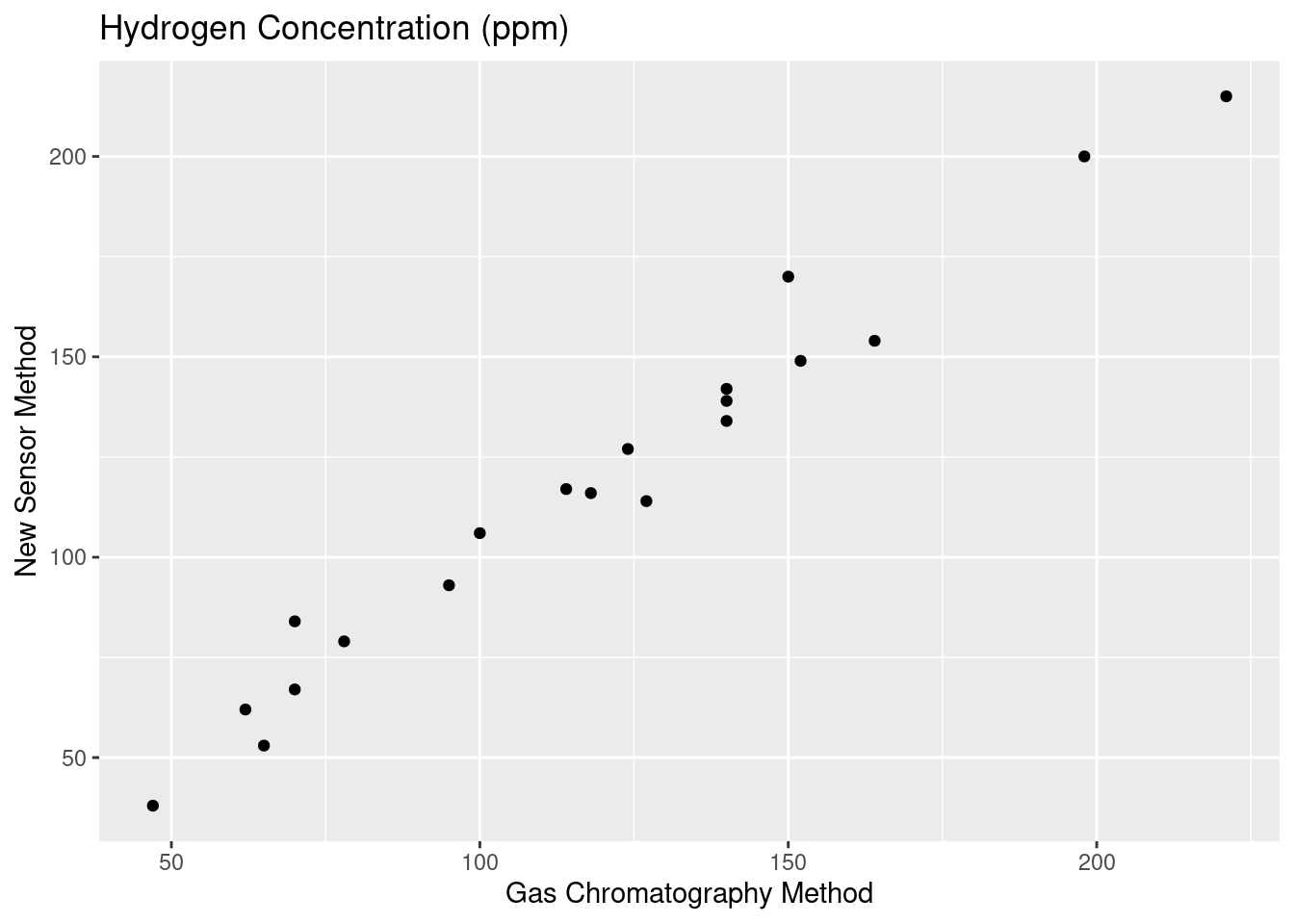
The two methods appear to have a strong relationship. Judging exclusively from the scatterplot, the measurements also seem to not have that much deviation. There is some slight variance of course, but the measurements appear to be roughly equivalent in their quality.
Exercise 4.
The accompanying data on y = ammonium concentration (mg/L) and x = transpiration (ml/h) was read from a graph. Based on the data and the scatterplot generated, describe the relationship between the variables. Does a simple linear regression appear to be an appropriate modeling strategy?
x <- c(5.8, 8.8, 11, 13.6, 18.5, 21, 23.7, 26, 28.3, 31.9, 36.5,
    38.2, 40.4)
y <- c(7.8, 8.2, 6.9, 5.3, 4.7, 4.9, 4.3, 2.7, 2.8, 1.8, 1.9,
    1.1, 0.4)

df <- data.frame(x, y)
ggplot(data = df, aes(x = x, y = y)) + geom_point() + theme_gray() +
    xlab("Transpiration (ml/h)") + ylab("Ammonium Concentration (mg/L)")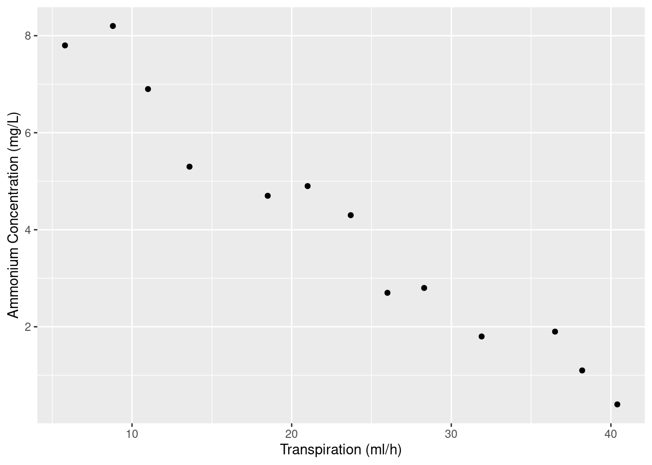
There appears to be a negative linear relationship between the amount of transpiration and the ammonium concentration. I feel a linear regression model here would absolutely suffice.
Exercise 5:
An experiment was done to investigate how the behavior of mozzarella cheese varied with temperature. Consider the accompanying data on x = temperature and y = elongation(%) at failure of the cheese.
x <- c(59, 63, 68, 72, 74, 78, 83)
y <- c(118, 182, 247, 208, 197, 135, 132)
df <- data.frame(x, y)

ggplot(data = df, aes(x = x, y = y)) + geom_point() + theme_gray() +
    xlab("Temperature") + ylab("Elongation (%)") + xlim(0, 90) +
    ylim(0, 250)
ggplot(data = df, aes(x = x, y = y)) + geom_point() + theme_gray() +
    xlab("Temperature") + ylab("Elongation (%)") + xlim(55, 90) +
    ylim(100, 250)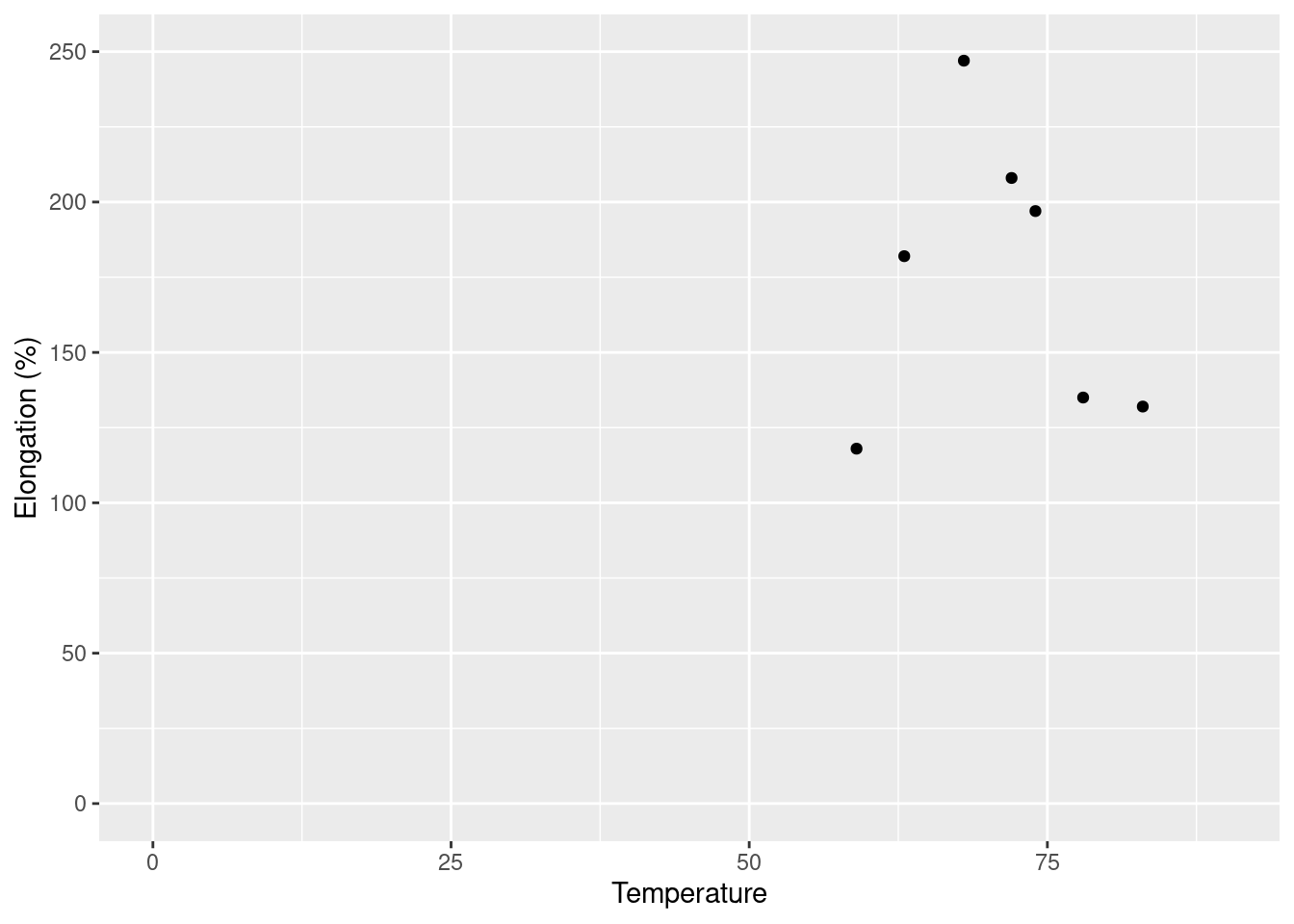
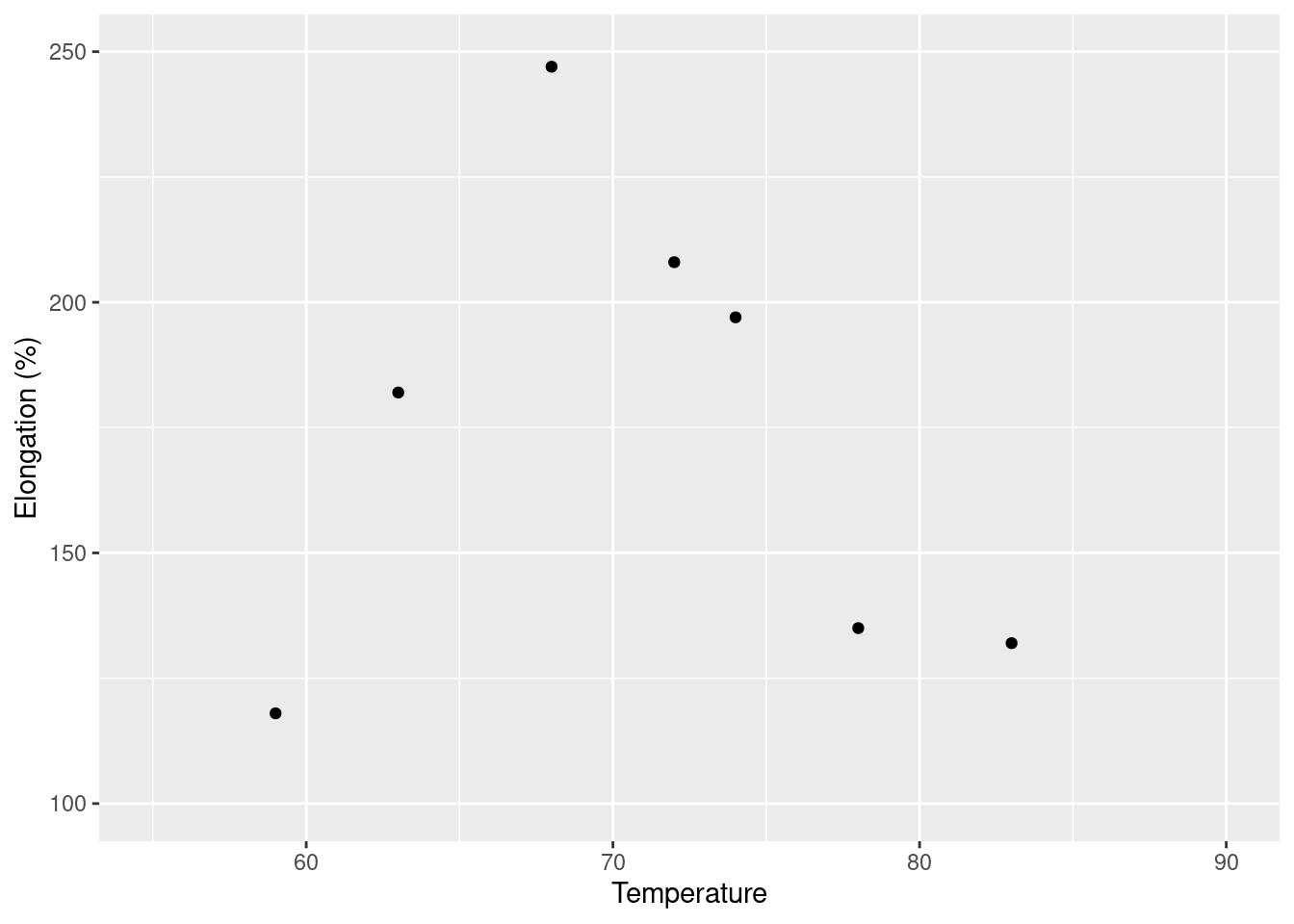
The plot with the axes intersecting at (0, 0) appears to be quite misleading. Because all of the data is in the upper right it may be easy to assume a linear relationship where there may not be one. With the second plot which is zoomed into that area, it becomes more clear that there doesn’t seem to be much of a linear relationship going on at all. The second, zoomed in, plot is preferable as it presents the data points with more clarity.
Exercise 7.
The cited article considered regressing y = 28-day standard-cured strength (psi) against x = accelerated strength (psi). Suppose the equation of the true regression line is \(y = 1800 + 1.3x\)
a.
What is the expected value of 28-day strength when accelerated strength = 2500?
- Plugging 2500 into our regression formula gives \(y = 1800 + 1.3(2500) = 5050\).
b.
By how much can we expect 28-day strength to change when accelerated strength increases by 1 psi?
- Plugging 1 into our regression formula will show us an increase for accelerated strength of 1.3
c.
Answer part (b) for an increase of 100 psi.
- Following the logic of part (b) we will see an increase of 130 for accelerated strength.
d.
Answer part (b) for a decrease of 100 psi.
- This, much like part (c), will see a decrease of 130 for accelerated strength. In other words, a change of -130.
Exercise 8
Referring to exercise 7, suppose that the standard deviation of the random deviation \(\epsilon\) is 350 psi.
a.
What is the probability that the observed value of 28-day strength will exceed 5000 psi when the value of accelerated strength is 2000?
- We are looking for \(P(Y > 5000 | x^* = 2000)\). We know that \(\sigma = 350\) and that \(f(x) = 1800 + 1.3x\). The following calculation will be shown and then represented with code.
\[P(Y > 5000 | x^* = 2000) = P \left( Z > \frac{f(2000) - 5000}{350}\right)\] \[= 1 - \text{normalcdf(-100, -1.714)}\] \[\approx .957\]
func_ex8 <- function(x) {
    ret_val <- 1800 + (1.3 * x)
    return(ret_val)
}

z <- (func_ex8(2000) - 5000)/350
cat("The probability of observing this is approximately", round(1 -
    pnorm(z), 3))
## The probability of observing this is approximately 0.957b.
Repeat part (a) with 2500 in place of 2000.
- The same code will be utilized again.
z <- (func_ex8(2500) - 5000)/350
cat("The probability of observing this is approximately", round(1 -
    pnorm(z), 3))
## The probability of observing this is approximately 0.443c.
Consider making two independent observations on 28-day strength, the first for \(x = 2000\) and the second for \(x = 2500\). What is the probability that the second observation will exceed the first by more than 1000psi?
- For this we need to calculate things a little bit differently. We have the following formula:
num <- func_ex8(2500) - func_ex8(2000) - 1000
den <- sqrt(2 * 350^2)
quotient <- num/den
round(pnorm(quotient, lower.tail = FALSE), 3)
## [1] 0.76d.
Let \(Y_1\) and \(Y_2\) denote observations on 28-day strength when \(x = x_1\) and \(x = x_2\), respectively. By how much would \(x_2\) have to exceed \(x_1\) in order that \(P(Y_2 > Y_1) = .95\)?
- This isn’t as complex as it sounds. We simply flip around our unknown variables. Instead of knowing that \(\Delta_0 = 1000\) and not knowing \(Z\), we now know that \(Z = \text{invNorm}(.95) \approx 1.64\) and do not know \(\Delta_0\). We can rewrite the formula the following way:
This shows that \(x_2\) would have to be at least 811 larger than \(x_1\) for \(P(Y_2 > Y_1) = .95\).
Section 12.2: 13-17, 24
Exercise 13
The accompanying data on x = current density (mA / cm^2) and y = rate of deposition (\(\mu\)m / min) is provided. Do you agree with the claim by the article’s author that “a linear relationship was obtained from the tin-lead rate of deposition as a function of current density”? Explain your reasoning.
x <- c(20, 40, 60, 80)
y <- c(0.24, 1.2, 1.71, 2.22)
df <- data.frame(x, y)
ggplot(data = df, aes(x = x, y = y)) + geom_point() + theme_gray()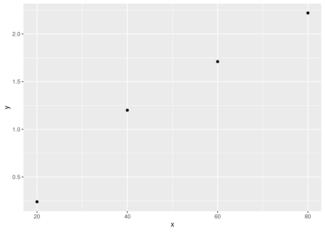
cat("The r^2 value for this data is", cor(x, y)^2)## The r^2 value for this data is 0.9716238I think we have a decent case of a linear relationship here. Based on the generated scatterplot and calculated \(r^2\) value being very close to 1 it seems like a fair statement to make. I, as always, worry about the tiny sample size provided. Though the numbers seem to indicate a perfect example of a linear relationship I feel I can’t confidently say one has been found given so few data points. There is always the chance these values were acquired by random chance and may not be indicative of anything beyond that.
Exercise 14
Refer to the tank temperature-efficiency ratio data given in Exercise 1.
a.
Determine the equation of the estimated regression line.
temp <- c(170, 172, 173, 174, 174, 175, 176, 177, 180, 180, 180,
    180, 180, 181, 181, 182, 182, 182, 182, 184, 184, 185, 186,
    188)
ratio <- c(0.84, 1.31, 1.42, 1.03, 1.07, 1.08, 1.04, 1.8, 1.45,
    1.6, 1.61, 2.13, 2.15, 0.84, 1.43, 0.9, 1.81, 1.94, 2.68,
    1.49, 2.52, 3, 1.87, 3.08)

df <- data.frame(temp, ratio)

ggplot(data = df, aes(x = temp, y = ratio)) + geom_point() +
    theme_gray() + stat_smooth(method = lm, se = FALSE)
## `geom_smooth()` using formula 'y ~ x'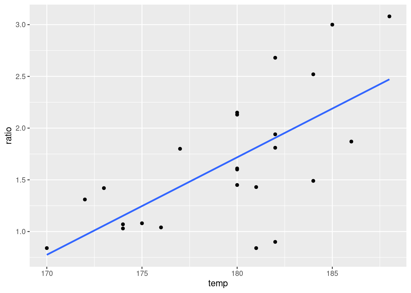
lm(ratio ~ temp)##
## Call:
## lm(formula = ratio ~ temp)
##
## Coefficients:
## (Intercept) temp
## -15.24497 0.09424lm() is equivalent to LinReg(a + bx) on my Ti-84 Calculator. (ratio~temp) indicates that ratio here is the response variable and that temp is a predictor.
The output of my code resulted in \(\beta_0 = -15.24\) and \(\beta_1 = 0.09\). This gives the equation: \[\boxed{f(x) = -15.24 + 0.09x}\]
b.
Calculate a point estimate for true average efficiency ratio when tank temperature is 182. - Plugging 182 into our equation gets \[f(182) = -15.24 + 0.094*182 \approx \boxed{1.868}\]
c.
Calculate the values of the residuals from the least squares line for the four observations for which temperature is 182. Why do they not all have the same sign?
What we know is that we need to compare our actual observations at 182 to what 182s output would be given our equation. We calculated the second part already, \(f(182) \approx 1.868\), so we just need to pull out our observed ratios and subtract 1.14 from them.
# Below code creates a list of ratios at the same index
# where the temp is 182 We then just subtract 1.868 from
# those values.
x <- df$ratio[which(df$temp == 182)]
x - 1.868
## [1] -0.968 -0.058 0.072 0.812What we see is a fairly decent range of values. This is unsurprising as our observations still have randomness to them. Some of those ratios will fall above the line of best fit, others will fall below it. If it falls above the line the residual will be positive, if it’s below the residual will be negative.
d.
What proportion of the observed variation in efficiency ratio can be attributed to the simple linear regression relationship between the two variables? - This is not as intimidating as it sounds. What this problem wants is \(r^2\) which is the proportion of variability in y that is explained by the x value. We can calculate this easily. First we calculate the correlation, ‘r’, using cor() and then we square it.
cat("r^2 is approximately", round(stats::cor(temp, ratio)^2,
    3))
## r^2 is approximately 0.451Exercise 15.
Values of modulus of elasticity (MOE, the ratio of stress, i.e., force per unit area, to strain, i.e., deformation per unit length, in GPa) and flexural strength (a measure of the ability to resist failure in bending, in MPa) were determined for a sample of concrete beams of a certain type, resulting in the following data.
a.
Construct a stem-and-leaf display of the MOE values, and comment on any interesting features.
moe <- c(29.8, 33.2, 33.7, 35.3, 35.5, 36.1, 36.2, 36.3, 37.5,
    37.7, 38.7, 38.8, 39.6, 41, 42.8, 42.8, 43.5, 45.6, 46, 46.9,
    48, 49.3, 51.7, 62.6, 69.8, 79.5, 80)
stem(moe, scale = 2)
##
## The decimal point is 1 digit(s) to the right of the |
##
## 2 |
## 3 | 034
## 3 | 566668899
## 4 | 01334
## 4 | 66789
## 5 | 2
## 5 |
## 6 | 3
## 6 |
## 7 | 0
## 7 |
## 8 | 00Judging by the plot, it seems there is a huge amount of concentration of values between 35 and 40. There is an immediate drop off in frequency once 50 has been reached, with only 5 moe values at or above 50.
b.
Is the value of strength completely and uniquely determined by the value of MOE? Explain. Without looking at a plot I would say no. Looking at the data in the book, there is a wide spread in strength values whereas the moe values are pretty tightly grouped. I highly doubt that the value of strength is only determined by the value of moe.
strength <- c(5.9, 7.2, 7.3, 6.3, 8.1, 6.8, 7, 7.6, 6.8, 6.5,
    7, 6.3, 7.9, 9, 8.2, 8.7, 7.8, 9.7, 7.4, 7.7, 9.7, 7.8, 7.7,
    11.6, 11.3, 11.8, 10.7)
df <- data.frame(moe, strength)
ggplot(data = df, aes(x = moe, y = strength)) + geom_point() +
    theme_gray()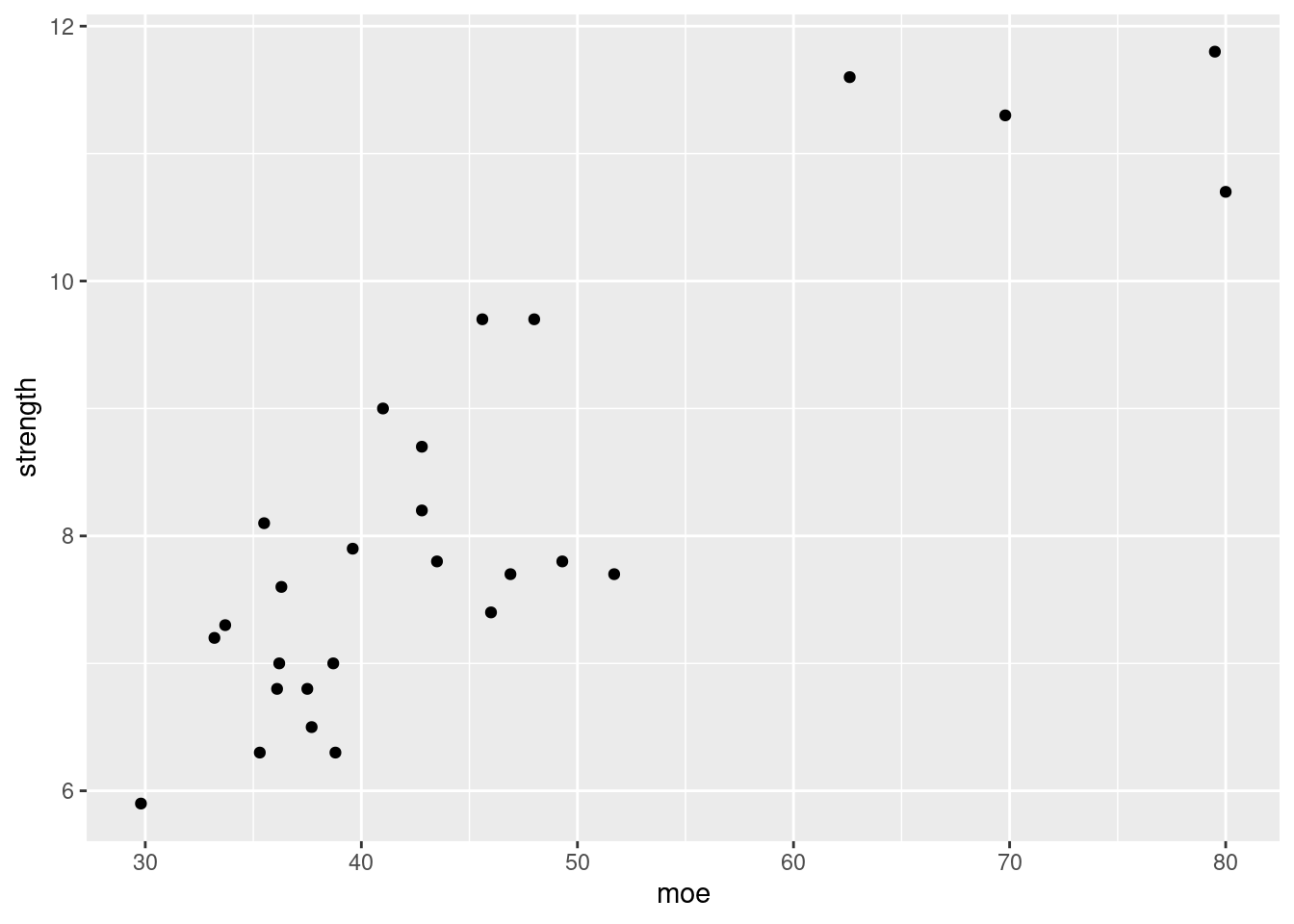
Judging from the scatterplot we can definitely see there is a chance of a relationship here. It’s still too scattered to say that strength is only being impacted by moe though.
###c. Use the accompanying minitab output (now shown here) to obtain: - The equation of the least squares line - prediction of strength given a moe of 40.
Would you feel comfortable using the least squares line to predict strength when moe is 100? Explain.
The minitab output would give us an equation of \[f(x) = 3.2925 + 0.10748x\]
Plugging 40 into our formula gives us \(f(40) \approx 7.5917\). As for if I would feel comfortable using this equation for predictions of strength given a moe of 100, I would not. We can fairly well predict values around 30 to 50 as we have many samples in that zone. We do not know for sure though if this relationship continues on like this as shown by the higher strength values. We only have 5 above 50 moe, and only 2 near 80. Predcictions in that region would already be unreliable, going beyond that would likely give us inaccurate predictions.
Exercise 16.
The article gave a scatterplot, along with the least squares line, of x = rainfall volume (\(m^3\)) and y = runoff volume (\(m^3\)) for a particular locatiion. The accompanying values were read from the plot.
x <- c(5, 12, 14, 17, 23, 30, 40, 47, 55, 67, 72, 81, 96, 112,
    127)
y <- c(4, 10, 13, 15, 15, 25, 27, 46, 38, 46, 53, 70, 82, 99,
    100)

df <- data.frame(x, y)
ggplot(data = df, aes(x = x, y = y)) + geom_point() + theme_gray()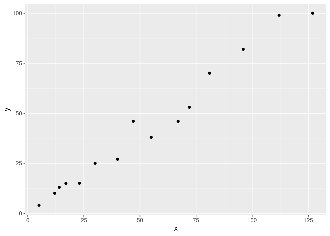
a.
Does a scatterplot of the data support the use of the simple linear regression model? - I would say yes. Based on the scatterplot there seems to be a very strong linear relationship here so it seems to be an appropriate model.
b.
Calculate the point estimates of the slope and intercept of the population regression line.
model <- lm(y ~ x, data = df)
model
##
## Call:
## lm(formula = y ~ x, data = df)
##
## Coefficients:
## (Intercept) x
## -1.128 0.827Based on the lm() functions output, our intercept is -1.128 and our slope is .827. This gives the equation \[f(x) = -1.128 + .827x\]
c.
Calculate a point estimate of the true average runoff volume when rainfall volume is 50.
Plugging 50 into our formula gives \(f(50) = -1.128 + .827 \cdot 50 \approx \boxed{40.22}\)
d.
Calculate a point estimate of the standard deviation \(\sigma\).
For this we’re going to use some code. The formulas for the desired values are as follows: \[\begin{aligned} \sigma &= \sqrt{\frac{SSE}{n-2}} \\\\\\[2mm] SSE &= \sum(\hat{y_i} - y_i)^2 \end{aligned}\]sse <- sum((stats::predict(model) - df$y)^2)
sigma <- sqrt(sse/(length(y) - 2))
cat("The sum of squares of residuals is", round(sse, 2), "\nThe point estimate of the standard deviation is",
round(sigma, 2))## The sum of squares of residuals is 357.01
## The point estimate of the standard deviation is 5.24e.
What proportion of the observed variation in runoff volume can be attributed to the simple linear regression relationship between runoff and rainfall?
cat("r^2 is approximately", round(cor(x, y)^2, 3))## r^2 is approximately 0.975Exercise 17.
No-fines concrete, made from a uniformly graded coarse aggregate and a cement-water paste, is beneficial in areas prone to excessive rainfaill because of its excellent drainage properties. The article cited in the book employed a least squares analysis in studying how y = porosity (%) is related to x = unit weight (pcf) in concrete specimens. Consider the following representative data.
x <- c(99, 101.1, 102.7, 103, 105.4, 107, 108.7, 110.8, 112.1,
112.4, 113.6, 113.8, 115.1, 115.4, 120)
y <- c(28.8, 27.9, 27, 25.2, 22.8, 21.5, 20.9, 19.6, 17.1, 18.9,
16, 16.7, 13, 13.6, 10.8)
df <- data.frame(x, y)a.
Obtain the equation of the estimated regression line. Then create a scatterplot of the data and graph the estimated line. Does it appear that the model relationship will explain a great deal of the observed variation in y?
model = lm(y ~ x, data = df)
model##
## Call:
## lm(formula = y ~ x, data = df)
##
## Coefficients:
## (Intercept) x
## 118.9099 -0.9047Based on the output of the function we get the following equation: \[f(x) = 118.9 - 0.9047x\]
ggplot(data = df, aes(x = x, y = y)) + geom_point() + theme_gray() +
stat_smooth(method = lm, se = FALSE)## `geom_smooth()` using formula 'y ~ x'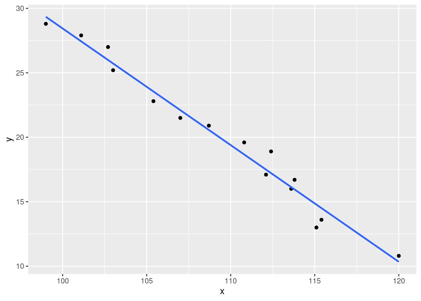
It appears that a lot, if not most, of the variation in y can be explained by x here.
b.
Interpret the slope of the least squares line.
The slope indicates that, if there is a relationship, that it’s negative. In other words, as the predictor grows the dependent variable decreases. In this case, it decreases by quite a lot!
c.
What happens if the estimated line is used to predict porosity when unit weight is 135? Why is this not a good idea.
new <- data.frame(x = c(135))
my_func <- function(x) {
118.9 - 0.9048 * x
}
cat("The prediction for porosity when unit weight is 135 is",
round(predict(model, newdata = new), 3), "\nNote: Above uses the predict function",
"\n\nThe same prediction done manually gives", my_func(135))## The prediction for porosity when unit weight is 135 is -3.229
## Note: Above uses the predict function
##
## The same prediction done manually gives -3.248Two methods for predicting are shown to be roughly equivalent here. The manual calculation utilized some rounding earlier on that explains the discrepancy. I did both methods just to sate my own curiosity.
As for why this prediction is a bad idea, the explanation is similar to an earlier question. We don’t have any x values that go that high, as such we don’t know if that behavior continues on indefinitely or if it shifts at some point.
d.
Calculate the residuals corresponding to the first two observations.
z <- df$y[1:2] - my_func(df$x[1:2])
cat("The first two residuals are", z[1], "and", z[2])## The first two residuals are -0.5248 and 0.47528e
Calculate and interpret a point estimate of \(\sigma\).
sse <- sum((stats::predict(model) - df$y)^2)
sigma <- sqrt(sse/(length(y) - 2))
cat("The sum of squares of residuals is", round(sse, 2), "\nThe point estimate of the standard deviation is",
    round(sigma, 2))
## The sum of squares of residuals is 11.44
## The point estimate of the standard deviation is 0.94The standard deviation is actually quite close to that of a standardized normal distribution. That’s pretty interesting.
f.
What proportion of observed variation in porosity can be attributed to the approximate linear relationship between unit weight and porosity?
cat("r^2 is approximately", round(cor(x, y)^2, 3))## r^2 is approximately 0.974Exercise 24.
The invasive diatom species Didymosphenia geminata has the potential to inflict substantial ecological and economic damage in rivers. The article cited in the textbook described an investigation of colonization behavior. One aspect of particular interest was whether y = colony density was related to x = rock surface area. The article contained a scatterplot and summary of a regression analysis. Below is the representative data.
x <- c(50, 71, 55, 50, 33, 58, 79, 26, 69, 44, 37, 70, 20, 45,
49)
y <- c(152, 1929, 48, 22, 2, 5, 35, 7, 269, 38, 171, 13, 43,
185, 25)
df <- data.frame(x, y)
model <- lm(y ~ x, data = df)ggplot(data = df, aes(x = x, y = y)) + geom_point() + theme_gray() +
stat_smooth(method = lm, se = FALSE)## `geom_smooth()` using formula 'y ~ x'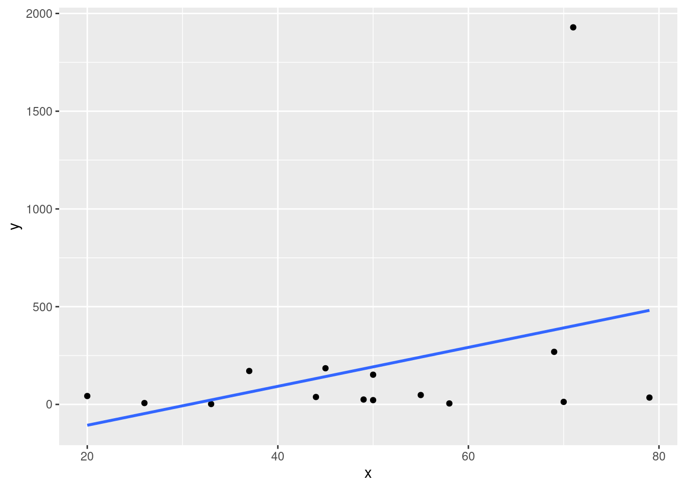
a.
Fit the simple linear regression model to this data, predict colony density when surface area = 70 and 71, and calculate the corresponding residuals. How do they compare?
model##
## Call:
## lm(formula = y ~ x, data = df)
##
## Coefficients:
## (Intercept) x
## -305.881 9.963my_generalized_func <- function(a, b, x) {
a + b * x
}
prediction <- my_generalized_func(-305.881, 9.963, 70:71)
actual_value1 <- df$y[which(df$x == 70)]
actual_value2 <- df$y[which(df$x == 71)]
actual_value <- c(actual_value1, actual_value2)
resid <- c(actual_value[1:2] - prediction[1:2])
cat("The predicted colony density when surface area", "= 70 is",
prediction[1], "\nThe predicted colony density when surface area",
"= 71 is", prediction[2], "\nThe calculated residuals are",
resid[1], "and", resid[2])## The predicted colony density when surface area = 70 is 391.529
## The predicted colony density when surface area = 71 is 401.492
## The calculated residuals are -378.529 and 1527.508The equation we get from this model is: \[f(x) = -305.881 + 9.963x\]
b.
Calculate the coefficient of determination.
cat("The r^2 value for this data is", round(cor(x, y)^2, 3))## The r^2 value for this data is 0.124c.
The second observation has a very extreme y value. This observation may have a substantial impact on the fit of the model and subsequent calculations. Eliminate it and recalculate the equation of the estimated regression line. Does it appear to differ substantially from the equation before the deletion? What is the impact on \(r^2\) and \(s\)?
df <- df[-c(2), ]model = lm(y ~ x, df)
model##
## Call:
## lm(formula = y ~ x, data = df)
##
## Coefficients:
## (Intercept) x
## 34.3734 0.7792The new equation we get from this is: \[f(x) = 34.3734 + 0.7792x\] This is, of course, very different from the previous equation.
cat("The r^2 value is", round(cor(df$x, df$y)^2, 3))## The r^2 value is 0.024The new \(r^2\) value is far less than previously! There doesn’t seem to be much of a linear relationship at all. For curiosity’s sake let us generate a new scatterplot with the new fitted line.
ggplot(data = df, aes(x = x, y = y)) + geom_point() + theme_gray() +
    stat_smooth(method = lm, se = FALSE)
## `geom_smooth()` using formula 'y ~ x'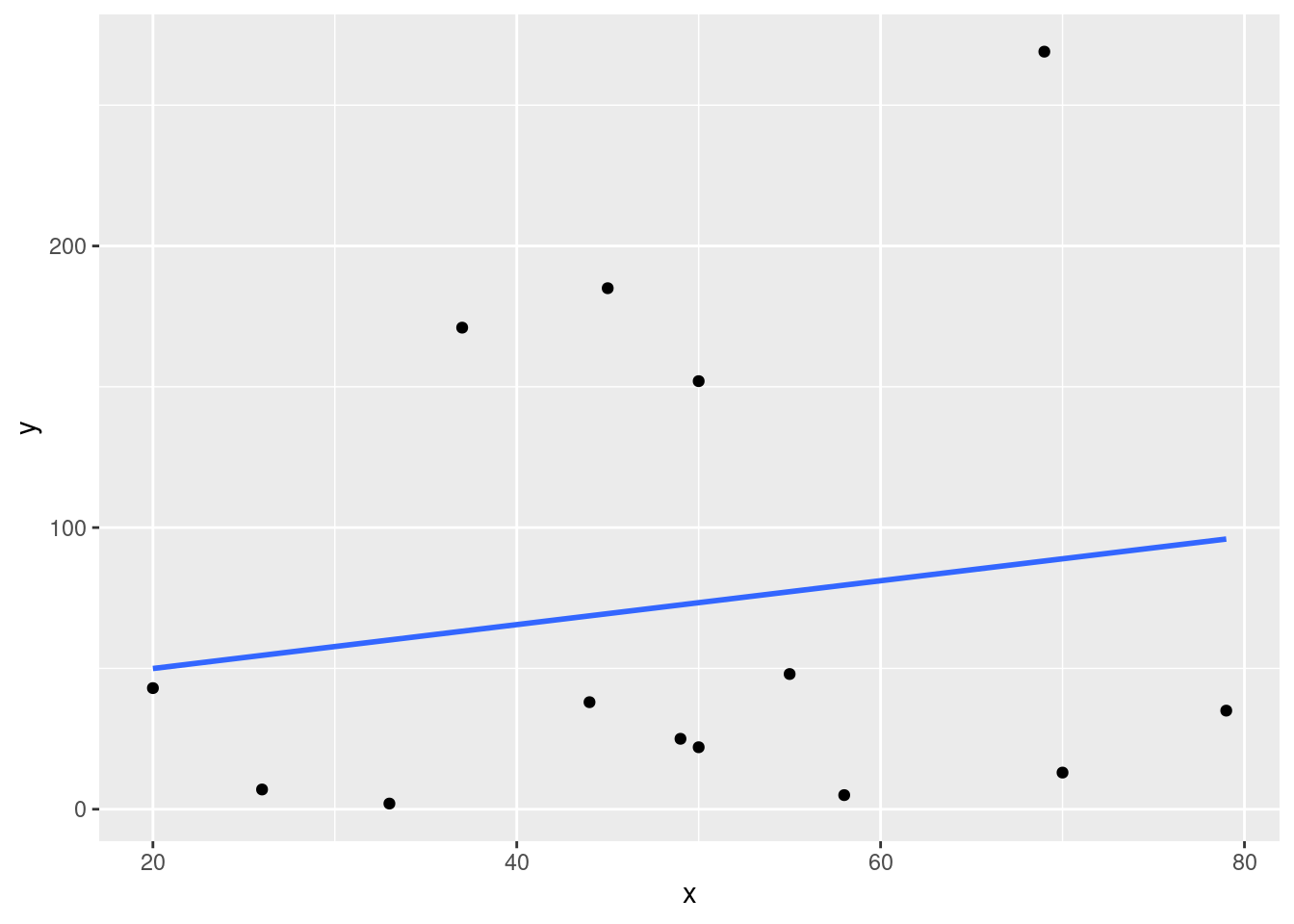
As we can see from this plot, now that the outlier is removed the values seem far more scattered than it appeared when it was zoomed out.